Who gets in? University benchmarks for better social mobility
About The Commission
The Social Mobility Commission is an independent advisory non-departmental public body established under the Life Chances Act 2010 as modified by the Welfare Reform and Work Act 2016. It has a duty to assess progress in improving social mobility in the UK and to promote social mobility in England. The Commission board comprises:
Chair:
Alun Francis OBE, Chief Executive of Blackpool and The Fylde College
Deputy Chairs
Resham Kotecha, Head of Policy at the Open Data Institute
Rob Wilson, Chairman and non-executive director across public, private and third sectors
Commissioners
Dr Raghib Ali, Senior Clinical Research Associate at the Medical Research Council Epidemiology Unit at the University of Cambridge
Ryan Henson, Chief Executive Officer at the Coalition for Global Prosperity
Parminder Kohli, Chair Shell UK Ltd and Shell Group Executive Vice President Sustainability and Carbon
Tina Stowell MBE, The Rt Hon Baroness Stowell of Beeston
Foreword
Alun Francis OBE
Chair of the Social Mobility Commission
Too often, the debate surrounding higher education treats access as a class problem, focusing on disparities in group outcomes and using compensatory strategies, like contextualised admission, to narrow the gap.
Our research suggests a more pressing challenge: students from disadvantaged backgrounds frequently get the required grades but fail to secure places that reflect this level of achievement. And too many universities – though by no means all – appear to have an intake which reflects socioeconomic advantage rather than merit. It is important to shine a light on this problem and to provoke a debate about what can and should be done to remedy it. This is what our report sets out to do.
For this reason, our vision from the outset was to create a pioneering diagnostic tool for the higher education sector. This report, Who gets in? University benchmarks for better social mobility, is a direct response to the government’s Inclusive Britain report, which recommended that the Social Mobility Commission provide better information to help disadvantaged students make choices about higher education.
Previous measures of university access have often combined graduate outcomes or simply compared a university’s intake to the general population. We want to ask a more precise question: are unequal university enrolments driven by the attainment gap in schools, or are there hidden barriers within universities’ own recruitment and admissions processes?
To answer this, we developed a new methodology, the ‘social mobility coefficient’, which compares a university’s actual student intake against the specific pool of young people who have successfully met its minimum entry requirements. This matters for social mobility because it attempts to isolate the root of the problem.
Our analysis shows that unequal access is not a uniform issue across the sector. In fact, we found that for the majority of universities (71%), the student intake is actually more disadvantaged than the pool of young people who meet their entry requirements. This shows us that most institutions are effectively recruiting from the available talent pool, proving that for the bulk of the sector, the primary barrier remains the attainment gap in schools.
However, our research also pinpoints an area of unfulfilled potential. 29% of universities recruit an intake that is more advantaged than the pool of qualified students available to them. This group predominantly consists of high-tariff institutions with high entry requirements. The data tells us that a substantial pool of qualified, disadvantaged talent exists, but these students are either not applying to these institutions, or are disproportionately unsuccessful if they do, which could be due to biases in recruitment and admissions practices.
Location also influences recruitment success. Lower-tariff universities in London consistently rank as the best performers for recruiting disadvantaged students. This is largely driven by the fact that there is a high concentration of highly qualified disadvantaged students living in London. When the data is adjusted to account for location though, the access gap for many institutions shrink. A lack of local, high attaining disadvantaged students therefore acts as a hurdle for many universities trying to diversify their intake.
This evidence, along with extensive stakeholder engagement, allows us to put forward a set of recommendations for the higher education sector:
- Improve data access and sharing agreements across government and the higher education sector to enable monitoring of fair access
- The Office for Students should tailor specific access goals and institutions should integrate these into their annual reporting
- Universities already achieving a diverse intake should share best practice, and prioritise completion, performance and labour market outcomes for students
- Universities with more advantaged intakes should remove internal admissions barriers, and deliver widening access interventions proportionate to their size
- Universities should create place-based collaboration and strategic partnerships between higher and further education institutions
When we ensure that disadvantaged students can access the institutions they are qualified for, we significantly improve their long-term earnings, career trajectories, and social mobility. Crucially, our diagnostic tool shows that these elite universities have the greatest scope to improve social mobility without needing to lower their academic standards.
We are concerned that debates around widening participation very often end up focusing on “moving the goalposts”, something we are not convinced necessarily works. But here we face a more acute problem. We have young people who are successfully reaching high academic standards, but who are not progressing into the kind of universities that they perhaps could.
It is not always the case that finding a disparity means there is an inherent unfairness underneath it, but it is deeply important that we shine a light on these patterns using the data we have. We intend for this report to serve as a diagnostic tool for the sector. We invite universities and stakeholders to engage with us, to help explain these findings, and to work collaboratively to ensure that every qualified student can reach their full potential.
Executive summary
This report presents the findings of an analysis to develop a set of benchmarks to capture the extent to which universities in England are supporting social mobility through widening access to higher education.
It summarises the socio-economic background of students attending university and compares this with the characteristics of 3 different groups of ‘potential entrants’: (1) the broader population of all students taking Level 3 qualifications, (2) the subset of students who meet the university’s entry requirements, (3) those students who live near the university and meet the university’s entry requirements.
These comparisons have the potential to act as a diagnostic tool, revealing the extent to which unequal access to higher education may be the consequence of differences in prior attainment between students from different socio-economic backgrounds, and whether student preferences and admissions practices may also be relevant.
In contrast to other similar benchmarking exercises, this analysis focuses exclusively on access to university and does not take into account differences in how student outcomes vary across providers. This enables us to be much more specific in diagnosing problems related to access in particular, and in identifying targeted solutions.
Key findings
The socio-economic profile of higher education students
- While students attending higher education are more socio-economically advantaged overall than the population of all young people in England, the average socio-economic profile of enrolling students varies hugely between universities.
- The long-standing challenge of widening participation in higher education does not appear to be universal across the entire sector. Around 60% of universities in our analysis recruit a disproportionately low number of students from disadvantaged backgrounds. However, around 26% actually recruit a greater proportion of disadvantaged young people than exists within the wider population of all young people. This leaves around 15% of universities whose student enrolment profile is broadly representative of the socio-economic profile of all young people in England.
- The universities which recruit the highest proportions of more advantaged students tend to be those that have higher-than-average entry requirements. Those which recruit the highest proportions of more disadvantaged students tend to be less academically selective institutions located in London.
The role of prior attainment
- School and college attainment at age 18 is highly stratified by socio-economic background. Around 45% of all young people do not achieve any A level or Level 3 BTEC qualifications by age 18, and young people from more disadvantaged backgrounds are much more likely to be in this group. Conversely, young people from more advantaged backgrounds are considerably more likely to achieve 3 A grades or higher at A level.
- Despite this, most universities (around 69%) recruit students who are on average more socio-economically disadvantaged than the population of students who meet their entry requirements.
- Just under a third of universities recruit students who are on average more advantaged than the population of students who meet their entry requirements. These universities tend to be academically more selective and could potentially recruit more disadvantaged students without lowering their entry requirements. The recruitment and widening-participation practices of these institutions may therefore warrant particular scrutiny.
The importance of place
- For universities that rely on local recruitment, a lack of qualified disadvantaged students in their surrounding area can limit their ability to diversify their intake without lowering entry requirements.
- The tendency of lower-tariff (1) universities in London to recruit high proportions of disadvantaged students is partly explained by the fact that large numbers of disadvantaged young people meeting their entry requirements live nearby. However, even when this is taken into consideration universities in London with lower entry requirements still appear to be successful in recruiting large numbers of disadvantaged students.
- High tariff institutions are more likely to recruit nationally rather than locally and should therefore be less affected by the numbers of socio-economically disadvantaged students who meet their entry requirements living nearby.
Recommendations
1: Improve data and sharing agreements to enable robust monitoring
- 1A: Acquire application data. To know whether qualified students are being rejected or simply not applying, the Office for National Statistics (ONS), the Department for Education (DfE) and other relevant data owners should collaborate to find a solution or alternative pathways for linked application data to be published at provider level.
- 1B: Prioritise individual-level data. The DfE and the Office for Students (OfS) should move the sector away from area-based proxies and expand the use of individual-level metrics, such as integrating verified household income data held by the Student Loans Company (SLC).
- 1C: Track vulnerable subgroups. The higher education sector must ensure that expanded data access explicitly identifies highly vulnerable groups often missed by broad socio-economic proxies, particularly students with experience of living in care.
2: Set tailored access goals and report on them annually
These new benchmarks would enable a move away from a ‘one-size-fits-all’ approach, supporting specific goals to be set in universities’ Access and Participation Plans (APPs) and in the Equality of Opportunity Risk Register (EORR). Higher education institutions should publicly link their financial planning to these goals by including a dedicated explanatory note in their annual financial statements.
3: Share best practice and prioritise student success
- 3A: Proactively share best practice across the sector. Universities that already excel in recruiting a diverse student intake should take the lead in identifying ‘what works’ and sharing this through national forums and sector databases such as the Higher Education Evaluation Library (HEEL).
- 3B: Prioritise completion, performance and labour market outcomes. Because ‘who gets on’ is just as critical as ‘who gets in’, universities must prioritise robust ongoing support to ensure disadvantaged students complete their degrees and successfully transition into strong career destinations.
4: Remove admissions barriers and raise overall school attainment
- 4A: Evaluate internal admissions barriers. Universities with disproportionately advantaged intakes must immediately audit their own admissions processes to identify and remove hidden barriers for qualified disadvantaged students.
- 4B: Mandate the use of sector evidence. The OfS should mandate that these specific universities actively apply proven sector evidence (such as from the HEEL) when establishing new recruitment and admissions practices.
- 4C: Deliver proportionate interventions and collaboratively expand the applicant pool. Rather than competing to recruit the few high-performing disadvantaged students, universities must deliver interventions proportionate to their size. They should engage in cooperative strategies with schools, colleges and the wider sector to tackle the attainment gap and expand the total pool of eligible applicants.
5: Create strategic regional partnerships
- 5A: Actively engage in regional widening-participation forums. Universities must stop competing regionally and instead participate in local networks (such as Uni Connect) to openly discuss region-specific access challenges, share effective outreach strategies and tackle under-representation collectively.
- 5B: Co-design inclusive pathways. Universities, further education colleges and employers must work together to create flexible educational pathways, such as foundation years and collaborative degrees, that support disadvantaged students while meeting local labour market needs.
(1) In the UK higher education sector, the terms ‘high-tariff’ and ‘low-tariff’ refer to the UCAS tariff points that students secure based on their academic qualifications, such as A levels and BTECs.
Introduction
This report presents the findings of an analysis to develop a set of benchmarks to capture the extent to which universities in England are supporting social mobility through widening access to higher education. To conduct this analysis, we constructed graphs for each higher education provider (2) in England, covering:
- the socio-economic profile of all young people in England
- the socio-economic profile of enrolling students at the institution
- the socio-economic profile of young people who meet the institution’s entry requirements (which in some cases may reflect how close they live to the institution)
Comparing these socio-economic profiles allows us to address the following questions:
- How representative is each institution’s intake of the socio-economic background of young people in England?
- To what extent can any under-representation of individuals from lower socio-economic backgrounds (or over-representation of individuals from higher socio-economic backgrounds) be explained by differences in institution entry requirements (coupled with socio-economic differences in the attainment of Level 3 qualifications)?
- To what extent can any under-representation of individuals from lower socio-economic backgrounds be explained by the fact that relatively fewer students from disadvantaged backgrounds who meet the institution’s entry requirements live near to the institution?
These comparisons have the potential to act as a diagnostic tool, revealing the extent to which unequal access to higher education may be the consequence of differences in prior attainment between students from different socio-economic backgrounds, and whether student preferences and admissions practices may also be relevant.
While we are aware of the potential downsides of league tables, as a public sector institution we have a duty to publish these results for the purposes of transparency. But it is important to note that our methodology has its limitations (see Section 6), and these league table estimates should therefore be viewed as a guidance tool rather than an absolute and final assessment of an institution’s performance on access and social mobility. We strongly encourage institutions to approach these tables with a collaborative rather than a competitive mindset, using the data to identify peers, learn from one another and share best practices across the sector. Ultimately, the aim of presenting the findings in this format is to maintain transparency while promoting positive, collaborative action to widen participation across higher education.
In contrast to other similar benchmarking exercises, we have deliberately focused our analysis exclusively on access to higher education rather than incorporating student outcomes. By isolating access, we can diagnose problems more specifically and identify targeted solutions. In particular, we can determine whether under-representation is driven by the attainment gap in schools or by hidden barriers in universities’ own recruitment and admissions processes. However, we recognise that what happens during and after graduation – including continuation at university, degree performance and labour market returns – is also extremely relevant for social mobility. Future research could use a similar benchmarking methodology to look at universities’ performance on these fronts.
This analysis focuses on the most traditional pathways into higher education, observing young people who enrol as full-time undergraduate students at age 18 or 19. We restricted our assessment of entry requirements to A levels and Level 3 BTEC qualifications, both to ensure a robust and statistically comparable model across all universities and because of limitations in data availability. Alternative entry routes, such as part-time study, foundation years and mature student enrolment, are also vital for widening participation and driving social mobility. As outlined under ‘Next steps for research’, future research could explore specific improvements to capture these important alternative pathways.
Population and data
The population used in this analysis is that of all young people in England who turned 16 and took their GCSE exams during the 2015 to 2016 academic year. This population includes young people attending both state-funded and independent (i.e. private fee-paying) schools. However, the available data for independent school pupils was less rich (as noted below).
We used national administrative datasets to gather the data (3), including:
- The National Pupil Database (NPD), supplied by the Department for Education (DfE). Within the NPD, we used data from the school census to observe students’ characteristics and Key Stage 4 and Key Stage 5 attainment datasets to observe attainment outcomes between the ages of 16 and 18.
- The Higher Education Statistics Agency (HESA) student record. We used this to observe whether students enrolled at a higher education provider, and if so, which provider they enrolled at.
The total size of the population was 588,300. Further details of the population and the data sources can be found in the technical appendix (4). Table 1 shows the progression of this population through the school system and (potentially) into higher education. It is worth noting that the time frame predates the COVID-19 pandemic. Although more recent cohorts were available, pandemic-related disruptions to the grading system led us to select earlier cohorts as a baseline. We note that trends in access to higher education are likely to have changed both during and after the pandemic.
Table 1: Attainment and higher education access for the population of interest
| Academic year | Description |
| 2015 to 2016 | GCSE examinations taken |
| 2016 to 2017 | Those who progress to Key Stage 5 undertake first year of study |
| 2017 to 2018 | Key Stage 5 attainment outcomes observed |
| 2018 to 2019 | Some pupils enrol in higher education at age 18 |
| 2019 to 2020 | Some pupils enrol in higher education at age 19 (or continue to a second year of study) |
Defining socio-economic background
All young people within this population were assigned to one of ten equally sized groups (deciles) based on their socio-economic background (SES). The decile scale ranges from 1 to 10. Those in decile 1 are the most socio-economically disadvantaged and those in decile 10 are the most advantaged.
Young people were assigned to different deciles based on the following factors:
- whether they were attending state-funded schools or independent schools during Year 11
- among state school students, whether they were known to be eligible for free school meals (FSM) in Year 11 or to have been eligible at any point in the 6 years up to and including Year 11 (known as FSM6)
- among state school students, the proportion of families in their local neighbourhoods who live in low-income households, measured by Income Deprivation Affecting Children Index (IDACI) score – the higher the score, the more low-income households there are in a student’s neighbourhood
In assigning students to deciles (see Table 2), we put greater weight on school type and FSM eligibility than on IDACI scores. This is because school type and FSM eligibility are individual measures of SES, whereas IDACI is an area-based measure. We considered students attending independent schools to be the most advantaged members of the population. These students were assigned to decile 10. Since less than 10% of the population attended an independent school, all such students could be assigned to this decile.
Students who were eligible for FSM in Year 11, or who had been eligible at any point in the 6 years up to and including Year 11 (FSM6), were allocated to the lower end of the SES distribution. FSM students were considered to be more disadvantaged than FSM6 students. Approximately a quarter of all students were either FSM or FSM6 and were allocated across deciles 1, 2 and 3.
IDACI scores were then used in the following way:
- to ‘top up’ decile 10, by allocating the most advantaged non-FSM state school students to this decile
- to support the allocation of FSM and FSM6 students across deciles 1, 2 and 3
- to distribute all remaining non-FSM students in state schools across deciles 3 to 9
Table 2: Distribution of students across SES deciles
| SES decile | Description | |
| 1 | FSM students | ↑ Increasing disadvantage |
| 2 | FSM and FSM6 students | |
| 3 | FSM6 and some state non-FSM students | |
| 4 | State non-FSM students | |
| 5 | ||
| 6 | ||
| 7 | ||
| 8 | ||
| 9 | ||
| 10 | Independent school students and some state non-FSM students | |
This method made as much use as possible of the different data variables available within national administrative datasets. However, there are some limitations in terms of what data is available. For example, administrative datasets such as the NPD do not contain details of the incomes or occupations of students’ parents or carers. When interpreting the results of the analysis, the following potential limitations of the SES categorisation should be considered:
- there may be some students who meet the eligibility criteria for FSM who have not applied for them – this would mean that they appear further up the SES distribution than they should
- neighbourhood measures of disadvantage such as the IDACI are not perfect proxies for individual SES, because there are likely to still be high-income households in neighbourhoods where there is a higher proportion of low-income households (and vice-versa)
- some students attending independent schools may reside in low-income households, for example if their fees are covered by bursaries or scholarships
(2) In this report, we use the terms ‘higher education provider’, ‘higher education institution’ and ‘university’ interchangeably to refer to English higher education providers registered with the Office for Students (OfS) that submit data to the Higher Education Statistics Agency (HESA). We provide information about this in Section 2.
(3) Accessed via the Office for National Statistics (ONS) Secure Research Service.
The socio-economic profile of higher education students
Key findings
|
For all universities in England and for each institution separately, we observed which students had enrolled by the age of 19. Once these students had been identified, we established what proportion of enrolling students were within each of the 10 SES deciles, and therefore how the SES distribution of enrolling students compared with that of the overall population of young people.
For a student to be counted as enrolling at a particular university, they had to be in their first year of study on a full-time undergraduate degree programme in autumn 2018 or autumn 2019, and to still be present at the university on 1 December in their year of enrolment. Further details are presented in the technical appendix (5).
Table 3 and Figure 1 present the socio-economic profile of first-year students attending any higher education provider in England who started at either age 18 in 2018 to 2019 or age 19 in 2019 to 2020. We established the percentage within each SES decile, then used these percentages to calculate cumulative percentages. We then plotted the cumulative percentages on a graph (on the Y axis) against the SES deciles (on the X axis).
Table 3: Socio-economic profile of students attending any higher education provider in England
| SES decile | Frequency (rounded) | Percentage (%) | Cumulative percentage (%) |
| 1 | 11,615 | 6 | 6 |
| 2 | 13,275 | 7 | 13 |
| 3 | 15,850 | 8 | 21 |
| 4 | 19,090 | 10 | 31 |
| 5 | 18,660 | 9 | 40 |
| 6 | 19,600 | 10 | 50 |
| 7 | 20,805 | 10 | 60 |
| 8 | 22,530 | 11 | 71 |
| 9 | 24,675 | 12 | 83 |
| 10 | 33,430 | 17 | 100 |
Figure 1: Socio-economic distribution of students enrolling at any English higher education provider at age 18 in 2018 to 2019 or age 19 in 2019 to 2020
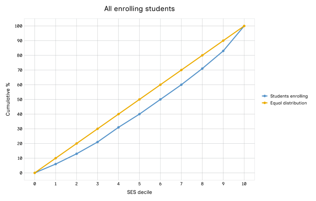
The yellow line represents a hypothetical scenario in which the enrolling student population is perfectly representative (in terms of socio-economic background) of the wider population of all young people in England. In other words, it represents a situation where 10% of all enrolling students are in each of the 10 SES deciles. The blue line represents the actual socio-economic profile of enrolled first-year full-time students.
Comparing the blue and yellow lines reveals the extent of the absolute gap in access to higher education by socio-economic background. Where the blue line is beneath the yellow line as in Figure 1, this suggests that among students enrolling in higher education, there is a disproportionately high number from more advantaged backgrounds and a correspondingly disproportionately low number from more disadvantaged backgrounds. Figure 1 shows that only 40% of enrolling students are in the bottom half of the socio-economic distribution (i.e. from deciles 1 to 5).
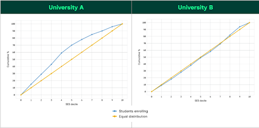
The analysis reveals that 60% of universities recruit a disproportionately high number of more advantaged students. By definition, this means that they also recruit a disproportionately low number of more disadvantaged students. However, this is not the case for all universities. For example, in Figure 2, the graph for University A shows that the university has recruited a disproportionately high number of disadvantaged students: around 70% of all students enrolling are from the bottom half of the socio-economic distribution. In this case, the blue line appears above the yellow line. Around a quarter of universities in England are in this position.
The remaining 15% of universities in England recruit a student population which is broadly representative of the socio-economic status of the wider population. The graph in Figure 2 for University B, illustrates such a scenario. This graph also shows that it is possible for the blue and yellow lines to cross over each other: the blue line can be above the yellow line at certain points in the SES distribution and beneath it at other points, depending on the exact proportions of students from different SES deciles who attend the institution.
Figure 2: Examples of a university recruiting a disproportionately high number of disadvantaged students (A) and a university recruiting proportionally to the wider population (B)
One way to quantify how representative a university’s enrolling population is of the wider population of all young people is to calculate the size of the area enclosed between the blue and yellow lines (6). While the numerical values produced in these calculations do not equate to a literal measure of students, they function as a comparative scale that allows us to rank and contrast different institutions.
The calculated area will be negative for universities which recruit a higher proportion of more advantaged students. This is the situation when considering all full-time first-year students in England, as illustrated in Figure 1, where the calculated area is −75 units. In Figure 2, University A has a calculated area of +115 units, indicating that it recruits a disproportionately high number of disadvantaged students. University B has a calculated area which is close to 0 (−5 units), as the sections of positive and negative areas largely cancel each other out. A list of all the calculated area gaps for the different higher education providers can be found in the technical appendix (7). There were no providers where the area between the lines was exactly 0. We considered providers to have an intake which was broadly representative of the wider population if the calculated area gap was between −25 and +25 units.
We excluded from the analysis any university which had fewer than 25 students (when rounded to the nearest 5) in any SES decile. This applied to 33 out of the 127 higher education institutions in the HESA data. These disproportionately smaller or more select institutions together represent just 8.7% of the population of students enrolling in higher education at age 18 in 2018 to 2019 or age 19 in 2019 to 2020. The socio-economic distribution of students attending one of the remaining 94 institutions for which we can create individual graphs is virtually identical to that of the overall population of students attending any of the full list of 127 institutions, suggesting that students attending these institutions are representative of the overall student population in terms of SES background.
Throughout this report, the terms ‘higher education provider’, ‘higher education institution’, and ‘university’ are used interchangeably. For the purposes of our benchmarking analysis, these terms all refer uniformly to the higher education providers in England that are registered with the Office for Students (OfS) in the approved categories and that submit statutory data returns to the HESA. We recognise that in a wider regulatory or sector context, these terms can carry slightly different legal or structural connotations – for example, not all registered higher education providers or colleges offering higher education hold the official university title. However, we use them synonymously in this report to aid readability when discussing the 94 institutions that make up our final analytical dataset.
Table 4 lists the 10 universities which have recruited the highest percentage of disadvantaged students. You can see the full list of institutions and their rankings in the technical appendix and interactive tool (8).
Table 4: Universities recruiting the highest proportions of disadvantaged students
| Rank | University | Average attainment points on entry |
| 1 | Middlesex University | 70.3 |
| 2 | University of East London | 67.6 |
| 3 | University of Bradford | 76.6 |
| 4 | University of Westminster | 74.6 |
| 5 | London South Bank University | 66.3 |
| 6 | Roehampton University | 62.9 |
| 7 | Brunel University London | 86.9 |
| =8 | University of Greenwich | 77.7 |
| =9 | University of Wolverhampton | 65.7 |
| 10 | City St George’s, University of London | 95.8 |
The third column of Table 4 shows average levels of attainment in A level and BTEC assessments at age 17 and 18 for enrolling students (the number of points attached to different qualifications is shown in the technical appendix (9)). To put these figures in context, the average (mean) for attainment points on entry for all 94 universities in the analysis is 94.3 (10).
Table 4 reveals that the universities which recruit the most disadvantaged students tend to be based in London: 8 out of the 10 are in the capital. In particular, it is those London universities that recruit students with slightly lower attainment that are recruiting the most disadvantaged students. Out of the 10 in the list, 9 have an average attainment entry score that is lower than the average for all universities. The higher-tariff universities in London (such as University College London, the London School of Economics and Imperial College London), which have higher entry requirements, are not found in the list.
We also identified the universities with the largest negative areas between the yellow and blue lines, i.e. those where students from more disadvantaged backgrounds are most under-represented. Table 5 lists the 10 universities with the lowest proportions of disadvantaged students (or the highest proportions of advantaged students) enrolled. Again, the full list of institutions and their rankings is available in the technical appendix. (11)
One trend which can be observed here is that the universities which admit the highest proportions of more advantaged students tend to be the ones with the highest entry requirements. Of the 10 in the list, 9 have average attainment on entry which is considerably higher than the average for all universities (of 94.3). Also, 9 out of 10 are members of the Russell Group of research-intensive universities. The exception is Oxford Brookes University, which is the only university with lower entry requirements to appear in the list.
Table 5: Universities which recruit the greatest proportions of more advantaged students
| Rank | University | Average attainment points on entry |
| 1 | University of Oxford | 151.3 |
| =2 | University of Exeter | 117.0 |
| =2 | University of Cambridge | 160.4 |
| 4 | University of Durham | 136.8 |
| 5 | University of Bristol | 131.9 |
| 6 | Oxford Brookes University | 84.2 |
| 7 | Newcastle University | 114.9 |
| 8 | Imperial College of Science, Technology and Medicine | 155.9 |
| 9 | University of Nottingham | 120.0 |
| 10 | University of Leeds | 131.7 |
(6) This is done by calculating the area underneath the blue line (all the way down to the X axis) and then subtracting from that the area underneath the yellow line.
(8) see See technical appendix and the University benchmarks data explorer tool.
(10) It should be noted that these figures differ slightly from the ‘entry requirements’ we calculate and use in later analysis
The role of prior attainment
Key findings
|
It is well established that average levels of attainment in school and college vary by socio-economic background. Where a given university recruits a disproportionately low number of disadvantaged students, this could be at least partly explained by the fact that young people from more disadvantaged backgrounds may, on average, be less likely to meet the university’s entry requirements.
This section describes how we took into account the role of differential attainment by socio-economic background. For each university in England, we established the socio-economic distribution of the sub-population of all young people in the cohort who meet the university’s entry requirements. This enabled us to compare the socio-economic profile of those meeting the entry requirements of a given institution and the socio-economic profile of those enrolling. In turn, this helps us to understand the extent to which socio-economic differences in prior attainment explain the under-representation of disadvantaged students at a particular university, and what other factors may be at play in explaining different SES profiles.
For the full population described earlier, we calculated each student’s attainment at Key Stage 5 (ages 17 and 18) in A levels and BTEC qualifications. In the technical appendix we provide a detailed description of the method we used to do this (12)
Meeting a university’s entry requirements
For each university in England, we established the socio-economic distribution of those meeting its entry requirements. Universities typically have different entry requirements for different courses. For example, a university’s entry requirements for medicine may be significantly higher than the same institution’s entry requirements for a social sciences course. Furthermore, universities admit different numbers of students to different courses. They might, for example, admit far fewer students to medicine than to social sciences courses. Our methodology took these factors into consideration.
For each university, each member of the original population of 16 year olds in England was assigned a weighting reflecting the extent to which they met the university’s entry requirements. These weightings ranged from 0 (those who would not be able to access any courses at the university) to 1 (those who would meet or exceed the entry requirements for all courses at the university). For example, a student whose attainment would enable them to access courses studied by 40% of all enrolling students at the university would be assigned a weighting of 0.4. Further details are provided in the technical appendix (13).
For each university, we established weighted frequencies by SES decile. We then converted these to percentages, and cumulative percentages, in a similar manner to that described above in relation to enrolment. The resulting cumulative percentages were added to the graphs in red, alongside the yellow and blue lines. Figure 3 illustrates this.
Figure 3: Example of a university including cumulative percentages of students meeting entry requirements (red line)
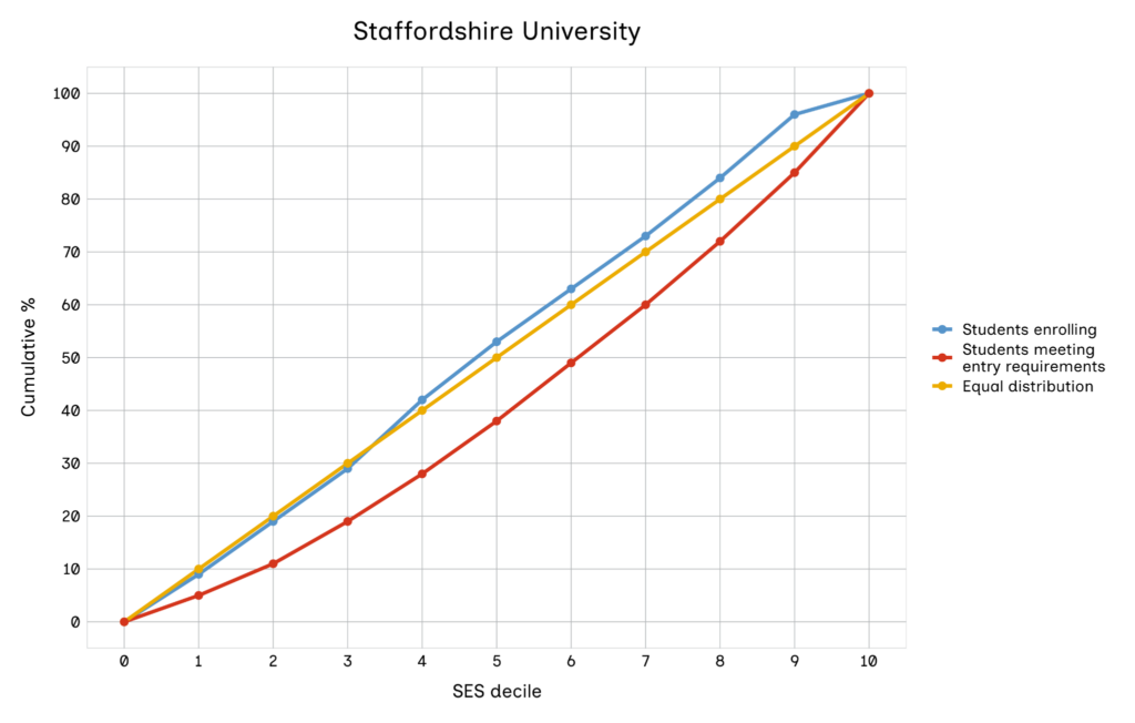 In this case, the SES profile of those meeting the entry requirements is more socio-economically advantaged, on average, than that of students who actually enrol, so the red line appears beneath the blue line. For some universities, however, the red line appears above the blue line – as in the example in Figure 4.
Figure 4: Example of a university where cumulative percentage of students meeting entry requirements (red line) is greater than that of students enrolling (blue line)
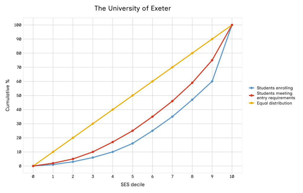
This means that the population of those meeting the university’s entry requirements is, on average, less advantaged than those actually enrolling at the university. This suggests that there could be some steps that the university might take to recruit more disadvantaged students, without having to lower their entry requirements.
The social mobility coefficient
As with the earlier comparison between blue and yellow lines, it is possible to quantify the size of some of these gaps by calculating the size of the area between the blue and red lines (14). This is what we refer to as the ‘social mobility coefficient’: this number indicates how universities are performing on recruiting disadvantaged students once attainment is taken into account.
Approximately 71% of the universities in our sample (67) had an area between the lines which was positive or 0. The remaining 29% (27) had an area which was negative. This means that for most universities, those meeting the entry requirements tend to be more advantaged, on average, than those who actually enrol. However, for a minority of universities, the average profile of those meeting entry requirements is less advantaged than that of those who actually enrol. For these universities, there may be scope to increase the proportion of disadvantaged entrants without having to lower entry requirements.
Table 6 shows the universities which recruit the most disadvantaged students, relative to the population of those meeting entry requirements.
Table 6: Universities recruiting the most disadvantaged students, relative to those meeting entry requirements
| Rank | University | Average points on entry | Social mobility coefficient |
| 1 | Middlesex University | 70.3 | 257 |
| 2 | University of East London | 67.6 | 253 |
| 3 | University of Bradford | 76.6 | 233 |
| 4 | University of Westminster | 74.6 | 228 |
| 5 | Brunel University London | 86.9 | 219 |
| 6 | London South Bank University | 66.3 | 219 |
| 7 | University of Greenwich | 77.7 | 211 |
| =8 | City St George’s, University of London | 95.8 | 210 |
| =8 | Roehampton University | 62.9 | 210 |
| 10 | University of Wolverhampton | 65.7 | 198 |
These are the same 10 universities as in Table 4, though the order is slightly different. The trend is therefore the same as that for absolute enrolment gaps by SES background, in that universities in London with lower entry requirements appear to recruit the highest proportions of disadvantaged students, relative to the population meeting entry requirements.
Table 7 shows the universities which recruit the most advantaged students, relative to the population meeting entry requirements. These universities may have the most scope to recruit more disadvantaged students without having to lower their entry requirements.
Table 7: Universities recruiting the most advantaged students, relative to those meeting entry requirements
| Rank | University | Average points on entry | Social mobility coefficient |
| 1 | Oxford Brookes University* | 84.2 | −132 |
| 2 | University of Exeter* | 117.0 | −79 |
| 3 | University of Oxford* | 151.3 | −69 |
| =4 | University of Leeds* | 131.7 | −66 |
| =4 | University of York | 122.9 | −66 |
| =6 | University of Durham* | 136.8 | −63 |
| =6 | University of Bristol* | 131.9 | −63 |
| 8 | University of Birmingham | 131.3 | −54 |
| 9 | Newcastle University* | 114.9 | −53 |
| =10 | University of Lancaster | 125.6 | −51 |
| =10 | University of Cambridge* | 160.4 | −51 |
Note: * denotes universities listed in Table 5.
Eight of the universities in Table 7 also appeared in Table 5 showing the universities with the biggest absolute gaps in enrolment by SES background. Most of these universities have higher entry requirements. Oxford Brookes University is an exception and appears to be a popular choice of university for more advantaged students with lower levels of attainment.
(14) To do this, for each university, we calculated the area underneath the blue line (down to the x axis) and then subtracted the area underneath the red line from this. The result can be a positive number (such as University C, where the calculated area is 102 units) or a negative number (such as University D, where the calculated area is −79 units).
The importance of place
Key findings
|
So far, this analysis has illustrated that the universities which tend to recruit the greatest proportions of disadvantaged students are not evenly distributed geographically. Rather, they tend to be concentrated in London. This could be explained by the fact that there is a greater concentration of higher-attaining disadvantaged students in London, coupled with the fact that some students may prefer to attend a university which is close to where they grew up.
In this section, we take account of the relative proximity of disadvantaged students who meet a university’s entry requirements, by introducing location weighting into the analysis. This weighting works on the premise that students may be more inclined to attend universities which are closer to their original area of residence and less inclined to move long distances away from home to attend university. While this is likely to be true to a large extent, there could be some limitations associated with the assumption. For example, students may be more willing to move a greater distance from home to attend a high-tariff university than a low-tariff one.
For each university, every prospective entrant was assigned a location weighting, calculated as the inverse of the distance in kilometres between the student’s home (at age 16) and the university. This was then used in conjunction with the qualification weighting (described in the previous section) to give greatest weight to individuals meeting more of the university’s entry requirements who lived closer to the institution. We might reasonably consider these students to have the greatest potential to enrol at the university.
Figure 5 illustrates the effect of introducing location weighing, using the example of a university based in London which has lower-than-average entry requirements.
Figure 5: Example of a university with (right chart) and without (left chart) location weighting
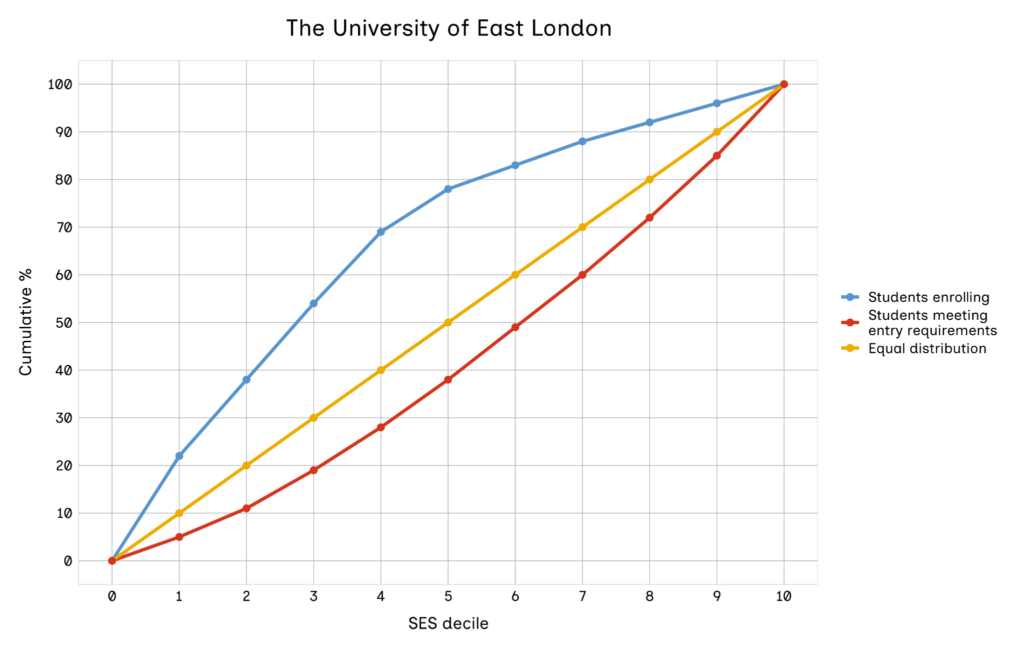
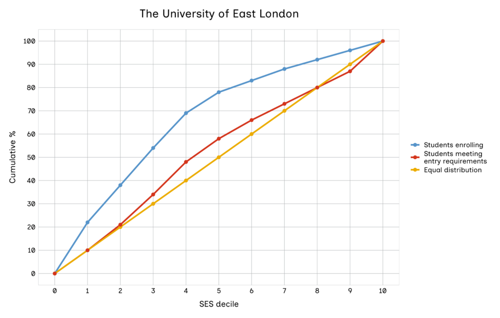
The blue line (reflecting actual enrolments) is in the same position on both graphs. However, in the location-weighted graph on the right, the red line appears higher than it does in the non-location-weighted graph on the left. This likely reflects the fact that there is a concentration of more disadvantaged students (who also meet the entry requirements) living close to the university. As more weight is placed on those living near to the university in the right-hand graph, the population of prospective students meeting the entry requirements becomes more disadvantaged and the line moves upwards. The upwards movement of the red line also has the effect of reducing the size of the area between the red and blue lines (the social mobility coefficient). This area is reduced from 253 units in the left-hand graph to 141 units in the right-hand graph. In other words, the fact that the university has been able to successfully recruit so many disadvantaged students becomes somewhat less noteworthy once we take into account the fact that there is a concentration of disadvantaged students (who meet the entry requirements) living close to the university.
Applying location weighting to the analysis does not always have the effect of moving the red line upwards, as illustrated in Figure 6.
Figure 6: Example of a university where once location weighting is applied, the cumulative percentage of students meeting entry requirements (red line) moves downward
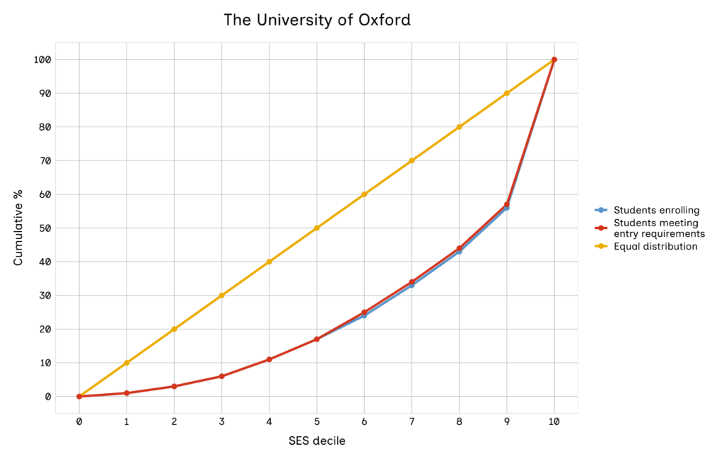
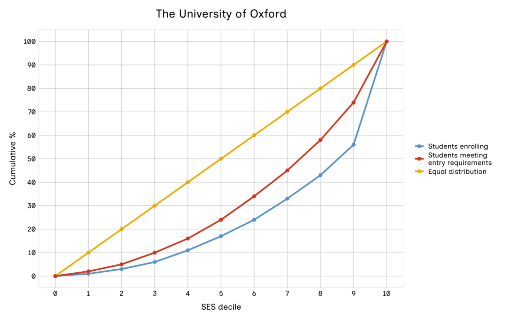
In this scenario, the red line moves down once the location weighting is applied. This could suggest that the population of those who meet entry requirements and live close to the university is more advantaged. This could partly explain why the university recruits a smaller proportion of disadvantaged students than might be expected, even relative to the population (nationally) of all students who meet their entry requirements.
Given that the red line moves following the use of location weighting (while the blue line remains unchanged), this has the effect of changing the size of the area between the blue and red lines (the social mobility coefficient). In the example in Figure 6, the size of the area between the lines reduces from −69 units to −12 units once we apply location weighting. On average, the gap between the lines is smaller once we apply location weighting, with the average area gap (for all higher education providers) dropping from 53.3 units without weighting to 37.8 units when weighting is used.
Once we had calculated area gaps between the red and blue lines for all the location-weighted graphs, we could identify the universities with the largest positive gaps (in other words, where the blue line is above the red lines). Table 8 lists these universities.
Table 8: Universities recruiting the most disadvantaged students relative to those meeting entry requirements, location weighting applied
| Rank | University | Average attainment points on entry | Social mobility coefficient |
| 1 | University of Bradford* | 76.6 | 189 |
| 2 | Brunel University London* | 86.9 | 187 |
| 3 | Middlesex University* | 70.3 | 184 |
| 4 | Roehampton University* | 62.9 | 175 |
| 5 | Kingston University | 69.7 | 154 |
| 6 | University of Wolverhampton* | 65.7 | 153 |
| 7 | University of Westminster* | 74.6 | 151 |
| 8 | University of Northampton | 66.3 | 149 |
| 9 | Coventry University | 80.0 | 141 |
| 10 | University of East London* | 67.6 | 141 |
Note: * denotes universities listed in Table 6.
Out of the 10 universities in Table 8, 8 also appeared in Table 6, where location weighting was not used. The location weighting has had the consequence of removing 3 London universities (London South Bank University, University of Greenwich and City St George’s). However, a new London university (Kingston University) has appeared, along with University of Northampton and Coventry University. The introduction of location weighting has therefore slightly reduced the number of London universities in this list (from 8 to 6) compared with Table 6. Nonetheless, these results suggest that universities in London are still effective in recruiting a large number of more disadvantaged students, even once we take into consideration the proximity of a large number of disadvantaged students who meet entry requirements.
Table 9 shows the universities with the largest negative area gaps between the blue and red (location-weighted) lines.
Table 9: Universities recruiting the most advantaged students, relative to those meeting entry requirements, location weighting applied
| Rank | University | Average points on entry | Social mobility coefficient |
| 1 | University of Birmingham* | 131.3 | -103 |
| 2 | Oxford Brookes University* | 84.2 | -93 |
| 3 | University of Liverpool | 116.1 | -92 |
| 4 | University of Leeds* | 131.6 | -89 |
| 5 | University of the Arts, London | 86.6 | -79 |
| 6 | University College London | 135.3 | -66 |
| 7 | Leeds Arts University | 93.4 | -61 |
| 8 | University of Manchester | 129.9 | -58 |
| 9 | University of Exeter* | 117.0 | -57 |
| 10 | University of Lancaster* | 125.6 | -55 |
Note: * denotes universities listed in Table 7.
There is some overlap between the universities in this list and those in Table 7, which does not account for location weighting, with 5 appearing in both lists. For some of the highest-tariff universities (such as University of Oxford and University of Cambridge), the gaps between the red and blue lines reduce once we apply location weighting, although we would expect these institutions to recruit nationally rather than locally.
In addition to Oxford Brookes University, 2 other universities with lower average attainment on entry appear in Table 9. However, these are both arts universities, where there may be less emphasis during admission on A level or BTEC attainment and more on other factors such as portfolios of submitted work or auditions. We do not account for such factors in the analysis.
University ‘types’
Key findings
|
We grouped universities into different categories, with all universities in the same category showing similar patterns in terms of the socio-economic access gradient. We did this on the basis of the non-location-weighted graphs. We undertook the grouping presented in this section using a combination of visual inspection of graphs and the drawing of certain thresholds within the data.
Below we discuss and present examples of the following university ‘types’:
- universities with the highest proportions of the most advantaged students – these universities have high proportions of enrolling students from decile 10, most of whom attended independent schools
- other universities with the highest absolute gaps in enrolment – these universities recruit a lower proportion of more disadvantaged students overall
- universities which are broadly representative by SES – where roughly 10% of enrolling students can be found in each of the 10 SES deciles
- universities with small gaps between the red and blue lines – where the socio-economic distribution of those meeting entry requirements is similar to that of those enrolling
- universities which recruit the highest proportions of disadvantaged students – these universities recruit a particularly high proportion of students from disadvantaged backgrounds
There are a small number of institutions whose patterns do not fit naturally into any of the above categorisations. We include figures for these institutions in the technical appendix. (15)
Universities with the highest proportions of the most advantaged students
A small number of universities recruit a particularly high proportion of students from decile 10. This is the most advantaged socio-economic decile in the analysis, comprising independent school students and those state school students who live in neighbourhoods with the lowest proportions of low-income households. The universities included in this group follow a pattern similar to the example in Figure 7. They are:
- University of Durham
- University College London
- University of Oxford
- University of Exeter
- University of Cambridge
- University of Bristol
- Oxford Brookes University
- London School of Economics and Political Science
- Imperial College London
Figure 7: University of Oxford – example of a university with the highest proportions of the most advantaged students
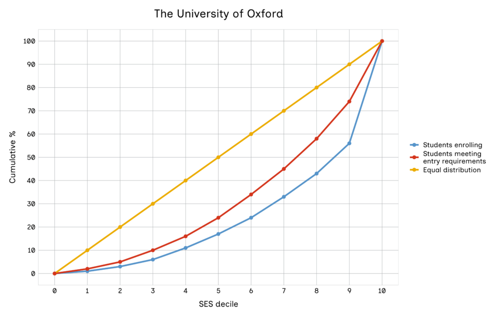
Note: This chart is based on the non-location-weighted model.
The graphs for all of these universities have blue lines which are steep at the end (from decile 9 to decile 10)(16). The 3 London universities in this group have slightly shallower lines further down the SES distribution, with blue and red lines that cross over one another. These London universities therefore recruit both a high proportion of more advantaged students and a high proportion of less advantaged students relative to the population of those students who meet their entry requirements.
The red lines are relatively low on these graphs, reflecting the fact that disadvantaged students may be less likely to meet the entry requirements for these universities. As the entry requirements tend to be lower at Oxford Brookes University, the red line appears higher and the gap between the red and blue lines is large.
Other universities with the highest absolute gaps in enrolment
This next group concerns other universities where disadvantaged students have lower enrolment rates – in other words, universities which have large gaps between the yellow and blue lines which are not already included in the first category above. These universities are:
- Loughborough University
- Newcastle University
- University of Birmingham
- University of Lancaster
- University of Leeds
- University of Liverpool
- University of Reading
- University of Sheffield
- University of Southampton
- University of Warwick
- University of York
- University of Nottingham
Figure 8: Loughborough University – example of other universities with the highest absolute gaps in enrolment
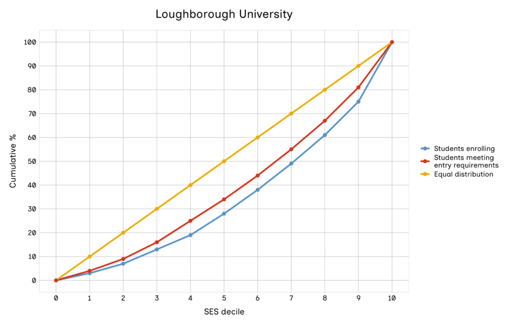
As Figure 8 shows, in this group there is a large gap between the yellow and blue lines, with the blue line always beneath the yellow line. However, even within the group there is variation in the extent to which the SES profile of entrants varies relative to the SES profile of those meeting the entry requirements. At most of these universities, the population of students meeting the entry requirements is more disadvantaged, on average, than the population of enrolling students. These universities may be able to take steps to recruit more disadvantaged students without having to lower their entry requirements.
University of Warwick seems to be an exception, where the enrolling population appears to be more disadvantaged than the population of students who meet entry requirements. University of Southampton and University of Nottingham have an SES enrolment profile which is very similar to that of students who meet their entry requirements.
Universities which are broadly representative by SES
Many universities have an enrolment profile which is broadly representative, by SES, of the population of all students. In these cases, roughly 10% of all enrolling students are found in each of the 10 SES deciles. Examples are:
- Buckinghamshire New University
- Canterbury Christ Church University
- De Montfort University
- Leeds Trinity University
- Liverpool Hope University
- St Mary’s University (Twickenham)
- Staffordshire University
- Manchester Metropolitan University
- University of Central Lancashire
- University of Kent
- University of Salford
- University of Derby
Figure 9: Buckinghamshire New University – example of universities which are broadly representative by SES
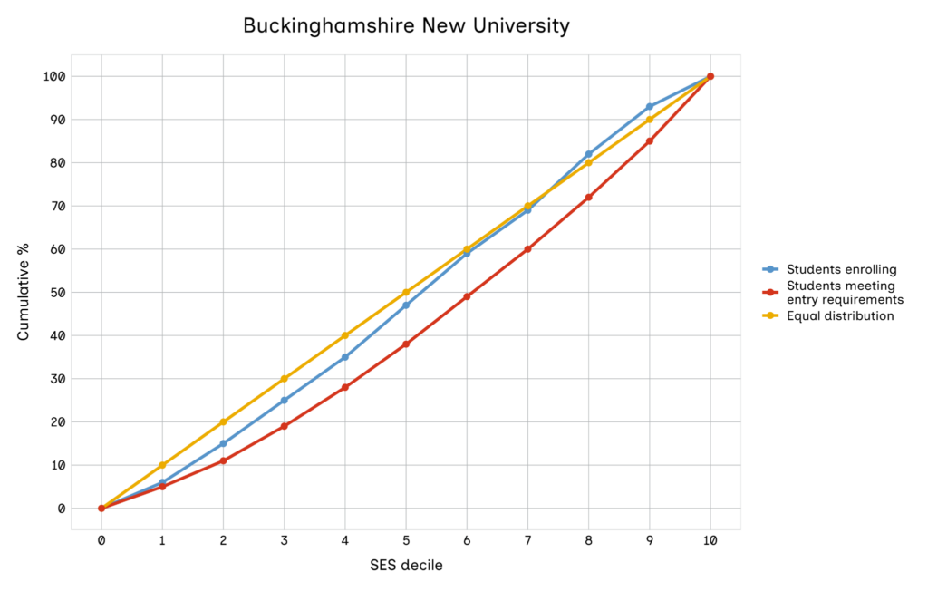
These universities are geographically dispersed, found in the north of England, the Midlands and the south. One thing that these universities have in common is that they tend to be slightly lower-tariff modern ‘post-92’ institutions.
As in the example in Figure 9, in these cases the red line is beneath the blue line. This means that the population of all enrolling students is more disadvantaged, on average, than the population of all students who meet the university’s entry requirements.
Universities with small gaps between the red and blue lines
For some universities, the SES profile of enrolling students closely mirrors the SES profile of all those who meet the university’s entry requirements. Some universities in this circumstance – such as University of Southampton and University of Nottingham – were already included in an earlier grouping. The list below and Figure 10 present examples of this type of university:
- Bournemouth University
- Leeds Beckett University
- Royal Holloway and Bedford New College
- University of Chester
- University of Lincoln
- University of Surrey
- Solent University
- Nottingham Trent University
- University of Chichester
- University of East Anglia
- University of Arts, London
- University of Manchester
- York St John University
- Northumbria University in Newcastle upon Tyne
- University of Plymouth
Figure 10: Bournemouth University – example of universities with small gaps between students meeting the requirements and students enrolling
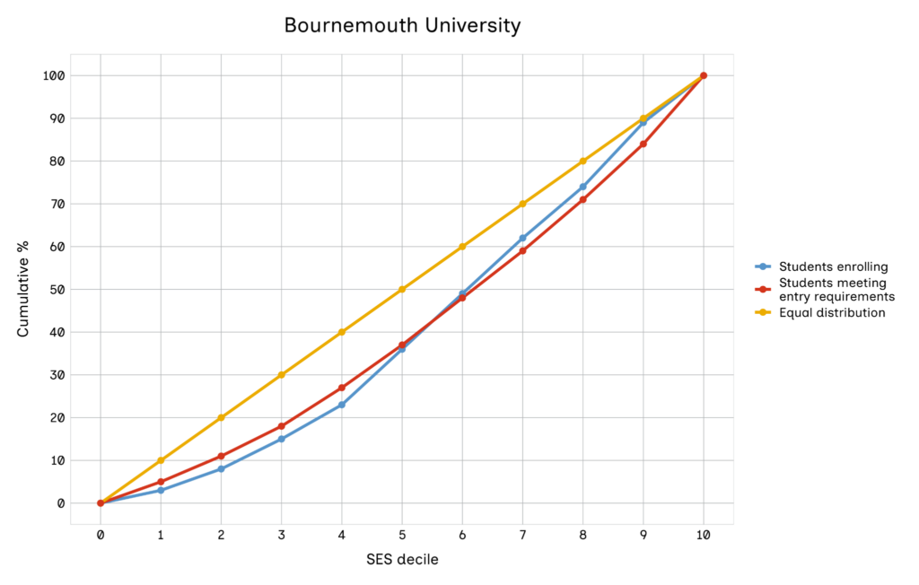
These universities are also dispersed geographically, found across all regions of England. As in Figure 10, the red and blue lines are always beneath the yellow line. At these universities, the SES profile of enrolling students tends to be more advantaged, on average, than that of all young people. However, in each case, the SES distribution of those enrolling simply mirrors that of those who meet entry requirements. Most of the universities in this group are institutions with lower entry requirements.
Universities which recruit the highest proportions of disadvantaged students
These universities recruit a disproportionately high number of disadvantaged students, compared with the wider population. They are:
- Aston University
- Birmingham City University
- Brunel University London
- City St Georges, University of London
- Coventry University
- Goldsmith College
- Kingston University
- London South Bank University
- Middlesex University
- Queen Mary University of London
- Roehampton University
- University of Bradford
- University of East London
- University of Greenwich
- University of Northampton
- University of West London
- University of Westminster
- University of Wolverhampton
- University of Bedfordshire
- University of Hertfordshire
Figure 11: Aston University – example of universities which recruit the highest proportions of disadvantaged students
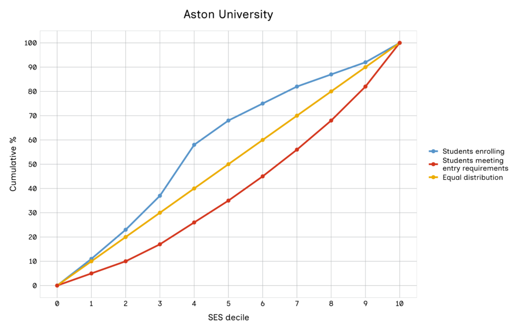
As illustrated by the example in Figure 11, these universities are characterised by high blue lines, which sit above the yellow lines. The red lines sit beneath the yellow lines, illustrating that the population of young people who meet the entry requirements for these universities is more advantaged, on average, than the population of all young people.
Nonetheless, the populations of students who actually enrol at these universities is more disadvantaged, on average, than the wider population of all young people. There will be many more advantaged students who meet the entry requirements for these universities, but these students tend to attend other universities instead.
The universities in this group tend to have lower-than-average entry requirements. There is the odd exception, such as Queen Mary University of London, which is a member of the Russell Group of research-intensive universities. Universities in London with lower entry requirements are also especially well represented in this group.
(16) To see the detailed charts for each university, visit the interactive tool [LINK]
Limitations
Data limitations
The robustness of our findings is primarily constrained by the use of administrative proxies for socio-economic status within the NPD, as direct data on parental income or occupation is unavailable. FSM eligibility identifies only those who have formally registered, potentially misclassifying eligible but unregistered students into higher SES deciles. Similarly, the IDACI is an area-based measure that may not accurately reflect the specific circumstances of individual households within a neighbourhood. For students in the independent sector, the absence of home postcodes necessitated the use of school locations as a proxy for geographical data, and we assigned all such students to the most advantaged decile, overlooking those attending on bursaries. Furthermore, the analysis of entry requirements is limited to A levels and BTECs, excluding approximately 11.2% of students with alternative qualifications. Finally, the dataset represents a pre-pandemic cohort (2018 to 2020), and 33 smaller or specialist institutions were excluded to comply with HESA reporting restrictions on low frequencies.
Methodological limitations
We had to make several specific assumptions in order to model university access, particularly regarding how entry requirements and student mobility are calculated. Rather than using advertised grades, we inferred entry requirements from the actual attainment of enrolled students, removing the bottom 10% to account for contextual offers. While this provides a realistic estimate, it remains an approximation rather than a definitive standard. This is compounded by the fact that for 12 high-tariff providers with very low BTEC intake, BTEC qualifications were not considered to meet entry criteria at all. The model also applies location weighting based on the premise that students prefer local institutions. However, this may be less applicable to high-tariff ‘national recruiters’ such as Oxford or Cambridge, for which students are historically more willing to travel. Additionally, the process of dividing students into equal SES deciles relied on arbitrary cut-offs within IDACI scores to maintain statistical balance, which may influence the precision of decile-based comparisons.
Conceptual limitations
From a conceptual standpoint, the scope of this research is strictly limited to the point of university access and enrolment. It does not extend to the student journey beyond admissions, meaning that it does not evaluate crucial outcomes such as university continuation rates, final degree classifications or subsequent graduate earnings. Moreover, while the benchmarks compare the profile of qualified individuals against those who eventually enrol, they do not track application behaviour. Therefore, the analysis can identify the under-representation of disadvantaged students at specific institutions, but it cannot definitively determine whether this is a result of student preferences and a lack of applications, or of the specific admissions practices and biases of the institutions themselves.
For further detail regarding the specific methodology employed and a comprehensive breakdown of these limitations, please refer to the technical appendix (17).
Recommendations
The innovative nature of the access curve and social mobility coefficient provides universities with a clear diagnostic tool to understand whether recruitment gaps are due to prior attainment differences or other barriers in their recruitment and admissions processes. The analysis shows that social mobility success is achievable across different types of institutions, whether they are high tariff and national, low tariff and regional, or anywhere in between.
Policy recommendations
Informed by the findings presented in this report, we make the recommendations below.
Recommendation 1: Data holders/owners across government and the higher education sector should improve data and sharing agreements to enable robust monitoring of fair access
To build an accurate picture of social mobility, the sector must move away from area-based proxies and secure access to more-precise and better-linked data. Specifically, we recommend:
- 1A: Acquire application data. Securing this data at higher education provider level is essential in order to distinguish whether under-representation is driven by a lack of applications from disadvantaged students or by the universities’ own admissions practices.
DfE, ONS and other relevant data owners should collaborate to find a solution or alternative pathways for linked application data to be published at provider level.
- 1B: Prioritise individual-level data. The DfE and the OfS should establish consensus, between themselves and across the sector, on socio-economic status measures and expand the use of individual-level metrics. The sector should also integrate household income data held by the Student Loans Company (SLC).
- 1C: Track vulnerable subgroups. Bodies that collect student data, such as the DfE, UCAS and HESA, should expand data access to allow the identification and tracking of highly vulnerable groups that are often missed by broad socio-economic proxies, particularly students with experience of being in care or those in long-term unemployed families.
Recommendation 2: The OfS should set specifically tailored access goals, and higher education institutions should integrate these goals into their annual reporting
Since universities have different socio-economic profiles, a ‘one-size-fits-all’ approach to widening access will not work. This is already recognised by the OfS, which monitors universities’ Access and Participation Plans (APPs). The OfS should use these benchmarks to tailor specific access goals and guidelines around APPs and the Equality of Opportunity Risk Register (EORR)(18).
Higher education institutions should integrate these tailored OfS access goals into their annual reports, including an explanatory note in their financial statements. This will connect their financial planning to their access and participation objectives, which should drive more proactive management at the highest levels.
Recommendation 3: Universities excelling in diverse and representative access should share best practice and prioritise completion, performance and labour market outcomes
- 3A: Proactively share best practice across the sector. Universities with strong performance in recruiting socio-economically diverse student intakes should identify ‘what works’ and share this through national and regional forums. This will promote collaborative, place-based approaches rather than focusing on competition. To ensure this translates into sector-wide improvements, universities should publish their evidence in available sector databases, such as the Higher Education Evaluation Library (HEEL)(19).
- 3B: Prioritise completion, performance and labour market outcomes. Widening access is only the first step: ‘who gets on’ is as critical as ‘who gets in’. Universities must prioritise ongoing support to help students from disadvantaged backgrounds to navigate their degree, achieve strong academic performance and transition successfully to career destinations.
Recommendation 4: Universities with disproportionately advantaged intakes should remove internal admissions barriers and deliver interventions proportionate to institutional size, using sector evidence to establish these new practices
- 4A: Evaluate internal admissions barriers first. If an institution is failing to recruit from the existing pool of qualified disadvantaged students, it must audit its admissions processes to identify areas for improvement within its context and specific needs.
- 4B: OfS should mandate the use of sector evidence to establish new practices. Universities must consider and apply evidence from shared sector resources, specifically the HEEL, when establishing recruitment and admissions practices. This ensures that institutions are held accountable for adopting best practices.
- 4C: Deliver interventions proportionate to institutional size and collaboratively expand the applicant pool. Universities must adopt concrete practices where the magnitude of the work is directly proportionate to the size of the institution. Widening participation should be recognised as a wider education sector effort, not a burden for universities to carry alone. The school attainment gap remains a primary barrier to access; rather than competing to recruit high-performing disadvantaged students, universities must co-operate with schools, colleges and the wider sector to tackle this gap and expand the total pool of eligible applicants.
Recommendation 5: Universities should create regional place-based and strategic partnerships between higher education and further education institutions to drive regional social mobility
Widening access must be a collaborative endeavour, not a competition between providers. To effectively tackle under-representation, the sector must shift towards a place-based approach that brings together local educational institutions such as mayoral authorities, local government and skills bodies, and employers around shared regional goals. Specifically:
- 5A: Actively engage in regional widening-participation forums. Universities should participate in existing regional networks (such as Uni Connect partnerships) (20)
- or lead the creation of new ones where they do not exist. Within these collaborative spaces, institutions should use the Social Mobility Commission benchmarks as a tool to openly discuss region-specific access challenges, share effective outreach strategies (see recommendation 3A), and build targeted partnerships to tackle under-representation collectively rather than competing for the same pool of students.
- 5B: Co-design inclusive pathways with further education colleges and employers. Universities, further education colleges and employers must work together to create flexible educational pathways (such as foundation years and collaborative degree programmes) that support students from all socio-economic backgrounds. These pathways should not only widen access to higher education but also directly address the specific skills and labour market needs of the regional economy.
Next steps for research
Following extensive consultation with the higher education sector, researchers, and social mobility organisations, we have identified several key areas for expanding and refining the university benchmarks in future iterations. To build a more comprehensive and actionable diagnostic tool, future research should focus on the following priorities:
- Update for most recent years and track long-term progress. The baseline data (2018 to 2020) reflects a pre-COVID-19 landscape. More recent data was available, but pandemic-related disruptions to the grading system would not have allowed us to create a baseline measure. At the same time, universities have significantly changed their approach to recruitment, admissions and contextual offer-making since the pandemic. Consequently, the analysis in this report may not fully capture recent improvements and challenges. Future research should use the most recent datasets (from 2023 onwards) to reflect the current reality and ensure that longer-term trends and changes are tracked over time.
- Incorporate application and offer data into the benchmark charts. Currently, the benchmarks compare the profile of qualified individuals against those who eventually enrol, but they do not track application behaviour. Without application and offer data, we are not able to determine whether under-representation is driven by student preferences and a lack of applications, or by the admissions practices and offer rates of universities themselves. Future research should explore partnerships with bodies such as DfE and UCAS to secure this missing information. By plotting application and offer rates as additional lines on the benchmark charts, the tool will be able to pinpoint exactly where in the pipeline (outreach, application or offer stage) qualified disadvantaged students are being left behind.
- Include alternative entry routes and part-time and mature students. The benchmark is designed around the traditional full-time A level and BTEC pipeline for 18- and 19-year-olds; it does not include part-time learners, mature students and those entering through alternative routes such as foundation years. These exclusions were due to limitations in data availability and the need to ensure statistical robustness when estimating minimum entry requirements across the sector. However, given that these routes are vital for widening participation and sector resilience, future iterations of this research should explore ways to incorporate them.
(18) See OfS, ‘About the risk register’ (accessed 1 April 2026).
(19) See TASO (Transforming Access and Student Outcomes in Higher Education), ‘Project: Higher Education Evaluation Library (HEEL)’ (accessed 1 April 2026).
(20) See OfS, ‘About Uni Connect partnerships’ (accessed 1 April 2026).
Technical Appendix
In this technical appendix, we describe the process for generating the university social mobility benchmarks relating to access discussed in our main report.
At the heart of this process is the construction of graphs for each higher education (HE) provider in England covering:
- the socioeconomic profile of all young people in England;
- the socio-economic profile of enrolling students at each institution;
- the socio-economic profile of young people who meet each institution’s entry requirements (which in some cases may additionally reflect how close these individuals live to the institution).
The comparison of these socio-economic profiles allows us to address the following questions:
- How representative is each institution’s intake of the socio-economic background of young people in England?
- To what extent can any under-representation of individuals from lower socio-economic backgrounds (or over-representation of individuals from higher socio-economic backgrounds) be explained by differences in institution entry requirements (coupled with socio-economic differences in the attainment of Level 3 qualifications)?
- To what extent can any under-representation of individuals from lower socio-economic backgrounds be explained by the fact that relatively fewer students from disadvantaged backgrounds who meet the institution’s entry requirements live geographically proximate to the institution?
As outlined in the main report, we focus on the cohort of young people in England who turned 16 and took their GCSE exams during the 2015-16 academic year. We used information from the National Pupil Database (NPD) on students’ socio-economic background and, for those who stayed on post-16, their Key Stage 5 attainment. The Department for Education (DfE) links NPD records to records from the Higher Education Statistics Agency (HESA), who take an annual census of students attending higher education in any given year. We used this linked NPD-HESA data to identify which students went on to higher education at either age 18 or age 19 and to which provider.
The remainder of this appendix sets out in more detail how we processed the data to construct each of the elements contributing to the benchmarks outlined above. In all cases, the analysis was carried out within the Office for National Statistics (ONS) Secure Research Service (SRS) using the RStudio software package.
-
Defining the population of interest and measuring socio-economic status
This section describes how the population of interest was established and then divided into 10 deciles on the basis of pupils’ socio-economic status (SES).
1.1 Population of interest
The population of interest in this analysis was all school pupils in England who turned 16 and took their GCSEs during the 2015-16 academic year. Table 1 below shows the typical timeframe of different attainment and HE progression outcomes for this cohort.
Table 1 – Attainment and HE access timeframe for the population of interest
| Academic year | Description |
| 2015/16 | GCSE examinations taken |
| 2016/17 | Those who progress to Key Stage 5 undertake first year of study |
| 2017/18 | Key Stage 5 attainment outcomes observed |
| 2018/19 | Some pupils enrol in HE at age 18 |
| 2019/20 | Some pupils enrol in HE at age 19 (or continue to a second year of study) |
To identify this population, we used the Key Stage 4 attainment data table for 2015-16 from the National Pupil Database (NPD), which contained 609,637 observations. A small number of observations (12,295) in the data table concerned pupils who were not aged 15 at the beginning of the academic year, so we removed these. There were also a small number of cases (628) which did not have a unique pupil matching reference (PMR) – which is the identifier used to link pupils across data tables – which we also removed.
We additionally restricted our sample to those with non-missing information on socio-economic background (see further discussion below), meaning that our final analysis sample comprised 588,300 young people.
-
Measuring socio-economic status
Pupils’ SES was constructed from three indicators – school type, free school meals (FSM) eligibility and neighbourhood-level disadvantage, as measured using the Income Deprivation Affecting Children Index (IDACI).
FSM eligibility and IDACI scores are captured via the school census – specifically the spring 2016 census in our analysis – and hence are typically only available for pupils from state-funded schools. In some cases, these measures are merged into the relevant attainment datasets for ease of use.
1.2.1 School type
We constructed an indicator of whether each pupil sat their Key Stage 4 exams in either a state-funded school or an independent school, using the school type variable within the Key Stage 4 NPD dataset. For the purposes of allocating pupils into SES deciles, we considered independent school pupils to be more socio-economically advantaged than pupils attending state-funded schools.
1.2.2 Free school meals (FSM) eligibility
We used the measure of FSM eligibility from the Key Stage 4 pupil-level attainment table. Pupils are eligible for FSM if they live in a household with a low income, such that their parents or carers are entitled to certain means-tested benefits. In any given period, state school pupils are recorded either as ‘1’ (known to be eligible for free school meals) or ‘0’ (not known to be eligible for free school meals), with no missing values. It is worth noting that the ‘0’ designation should not be interpreted as ‘known to be ineligible for free school meals’, rather it comprises all students who are either ineligible for FSM or those who have not registered for FSM despite being eligible.
We made use of two different measures of FSM eligibility in the data:
- ‘FSM’ or ‘FSM eligible’: known to be eligible for FSM during Year 11;
- ‘FSM6’: known to be eligible for FSM at some point in the last 6 years (in Years 6 to 11 in our cohort).
FSM pupils are a subset of FSM6 pupils, given that all FSM pupils will have also been categorised as FSM6. For the purpose of our SES categorisation, we consider pupils who are eligible for FSM in Year 11 to be more disadvantaged than FSM6 pupils who were not eligible for FSM in Year 11.
Independent school pupils are typically not recorded in the data as being either FSM and/or FSM6. However, a very small number of independent school pupils (199) were recorded as FSM or FSM6, perhaps because they had moved between the state and independent sectors at some point. These pupils were flagged in the dataset, and in the subsequent allocation of pupils into SES deciles they were treated in the same manner as state school pupils who were neither FSM nor FSM6 (so, in essence, the two contrasting indicators of SES are considered to counterbalance one another).
1.2.3 Income Deprivation Affecting Children Index (IDACI)
IDACI is a neighbourhood-level measure of disadvantage. IDACI scores relate to the proportion of young people aged under 15 within a given small neighbourhood (a Lower Layer Super Output Area, LSOA) living in income-deprived families. There is therefore a parallel between IDACI and FSM eligibility, given that FSM eligibility is also related to low household income (albeit captured at an individual rather than neighbourhood level).
Whilst IDACI scores are available within the Key Stage 4 (KS4) data table, we used those provided in the school census data table instead, where it was provided to a greater number of decimal places than in the KS4 data table.
IDACI scores were matched from the school census into the Key Stage 4 data spine using PMR. In cases where an IDACI value was not found in the school census, the value in the KS4 data table was used instead, if it was available.
Overall, IDACI data was missing for 52,448 pupils (8.8%). However, we would not expect IDACI data to be available for independent school pupils since these pupils are not included in the school census. When IDACI data was missing for state school pupils, these pupils were removed from our analytical sample as it would not be possible to classify such pupils in to an SES decile using our proposed methodology. This led to the removal of 8,414 pupils (1.4%). Following this removal, the size of the population was 588,300.
1.2.4 Population SES characteristics
Table 2 below shows the proportion of pupils within our analytical sample who attended each school type. Table 3 shows the distribution of the population by FSM status.
Table 2 – Frequency and proportion of pupils by school type
| School type | Frequency (n) | Proportion (%) |
| State-funded school | 543,995 | 92.5% |
| Independent school | 44,305 | 7.5% |
| Total | 588,300 | 100.0% |
Table 3 – Frequency and proportion of pupils by FSM status
| FSM status | Frequency (n) | Proportion (%) |
| FSM pupils | 74,319 | 12.6% |
| FSM6, but not FSM | 74,554 | 12.7% |
| Neither FSM nor FSM6 | 439,427 | 74.7% |
| Total | 588,300 | 100.0% |
1.3 Distribution of the population into 10 SES deciles
In this section we describe how we divided the population into 10 equally-sized groups (deciles) on the basis of the three different SES measures described above. With a population size of 588,300, we aimed to assign 58,830 pupils to each decile group, ranging from 1 (most disadvantaged) to 10 (most advantaged).
As noted above, we start from the assumption that independent school pupils are more advantaged than pupils in state-funded schools, and that pupils who were eligible for FSM in Year 11 are more disadvantaged than FSM6 (but not FSM) pupils, who are in turn more disadvantaged than pupils who are neither FSM nor FSM6. We also assume that pupils with lower IDACI scores (i.e. a lower proportion of income deprived families living in their local neighbourhood) are more advantaged than those with higher ones.
We considered the 74,319 FSM pupils to be the most disadvantaged within the population, however SES decile 1 would not be large enough to accommodate all of these pupils. We therefore identified the 79.2% of FSM pupils who were the most disadvantaged according to the IDACI measure – this was FSM pupils with an IDACI score higher than 0.173. These pupils were allocated to SES decile 1.
All remaining FSM pupils who were not already allocated to decile 1 were then allocated to decile 2. Following this allocation, there were 43,341 places remaining in decile 2. These places were filled by the 58.1% most disadvantaged FSM6 (but not FSM) pupils, as determined by IDACI score. All FSM6 pupils with an IDACI greater than 0.251 were allocated to decile 2.
Any remaining FSM6 pupils who had not been allocated to decile 2 were then allocated to decile 3. This decile was then filled to capacity by using IDACI scores to identify the 27,616 most disadvantaged state school pupils who were neither FSM nor FSM6, which was all such pupils with an IDACI score greater than 0.456.
As independent school pupils were considered to be the most advantaged, these pupils were added to decile 10. All independent school pupils could be added to this decile, given that these pupils comprised less than 10% of the population. An additional 14,525 state school pupils were required to fill decile 10 and IDACI scores were used to identify those state school pupils who were the least disadvantaged. Any state school pupil with an IDACI score less than or equal to 0.0258 (who was also neither FSM nor FSM6) was added to decile 10. This meant that overall, 75.3% of pupils in decile 10 were from independent schools.
All remaining unallocated pupils were state school pupils who were neither FSM nor FSM6. These pupils were distributed across deciles 4 to 9 according to their IDACI scores. Table 4 below summarises the distribution of pupils across deciles.
Table 4 – Summary of the distribution of pupils across the SES deciles
| SES decile | Frequency (n) | Percentage (%) | Description |
| 1 | 58,830 | 10.0 | All those FSM pupils with an IDACI greater than 0.173 |
| 2 | 58,829 | 10.0 | All those FSM students with an IDACI less than or equal to 0.173. All those FSM6 pupils with an IDACI greater than 0.251 |
| 3 | 58,829 | 10.0 | All those FSM6 pupils with an IDACI less than or equal to 0.251. All state school pupils (neither FSM nor FSM6) with an IDACI greater than 0.456. |
| 4 | 58,823 | 10.0 | All those state school pupils (neither FSM nor FSM6) with an IDACI score less than or equal to 0.456 and greater than 0.286. |
| 5 | 58,835 | 10.0 | All those state school pupils (neither FSM nor FSM6) with an IDACI score less than or equal to 0.286 and greater than 0.187. |
| 6 | 58,831 | 10.0 | All those state school pupils (neither FSM nor FSM6) with an IDACI score less than or equal to 0.187 and greater than 0.123. |
| 7 | 58,825 | 10.0 | All those state school pupils (neither FSM nor FSM6) with an IDACI score less than or equal to 0.123 and greater than 0.0839. |
| 8 | 58,825 | 10.0 | All those state school pupils (neither FSM nor FSM6) with an IDACI score less than or equal to 0.0839 and greater than 0.054. |
| 9 | 58,843 | 10.0 | All those state school pupils (neither FSM nor FSM6) with an IDACI score less than or equal to 0.054 and greater than 0.0258. |
| 10 | 58,830 | 10.0 | All independent school pupils. All those state pupils (neither FSM nor FSM) with an IDACI less than or equal to 0.0258. |
| Total | 588,300 | 100.0 |
This approach implicitly assumes that the population of interest against which we want to compare comprises all pupils aged 16 who took GCSEs.
-
Identifying the socio-economic profile of enrolling students
Higher Education (HE) data was sourced from the Higher Education Statistics Agency (HESA). Two cohorts of data were used – those attending a higher education institution in 2018/19 and those attending in 2019/20. There were no duplicated PMRs in either of the data tables (although the same PMR was often present across the two tables).
2.1 Identifying HE providers
We first identified a list of HE providers for inclusion in our analysis. We began by identifying all unique UKPRNs (UK Provider Reference Numbers) present in either the 2018/19 and/or 2019/20 HESA data tables. We then matched these UKPRNs to provider name and location information from HESA which we ingested (with permission) into the SRS. Following this matching, we removed the UKPRNs of any HE providers not based in England. Following this removal, there were 127 UKPRNs (and associated provider names) which could be included in our analysis.
2.2 Establishing HE enrolment
For each HE provider, the following process was used to generate enrolment statistics.
Within the HESA 2018/19 data table, we identified those students at the provider who met all of these criteria:
- Were members of the December registration population (i.e. registered at the provider as of 1st December 2018)
- Were in their first year of study
- Were studying full time
- Were on an undergraduate degree programme
This process was then repeated to identify those students who met all of these criteria within the HESA 2019/20 data table (for those registered as of 1st December 2019).
These three population datasets – the base population of students taking GCSEs in 2015-16, and the populations of students enrolling for the first time for a full-time undergraduate degree at an English HE institution in either 2018-19 or 2019-20 – were then merged together using the common unique identifier (PMR), to ascertain which pupils in our base population had enrolled at a particular HE provider in either 2018 or 2019. Any pupil observed enrolling at the same provider both in 2018 and 2019 (perhaps because they had switched to a different degree programme) was considered to have enrolled in 2018 only. In cases where pupils were observed in both 2018 and 2019 at different providers, they were included in both relevant samples for analysis.
The original population was then filtered to include only those who had enrolled at an HE provider in either 2018 or 2019. A frequency table was then produced showing the number of enrolled students within each of the SES deciles (described above). These frequencies were then used to generate a percentage for each decile. These percentages were rounded to the nearest integer, to comply with HESA reporting requirements. These rounded percentages were then used to generate cumulative percentages. The cumulative percentage for decile 10 was set to 100 in all cases, even if the sum of individual percentages was not exactly 100 due to rounding. Table 5 below shows example enrolment data for one particular HE provider. Frequencies in this table have been rounded to the nearest 5.
Table 5 – Example enrolment data
| SES decile | Frequency | Percentage (%) | Cumulative percentage (%) |
| 1 | 75 | 5 | 5 |
| 2 | 100 | 7 | 12 |
| 3 | 110 | 8 | 20 |
| 4 | 140 | 10 | 30 |
| 5 | 155 | 11 | 41 |
| 6 | 170 | 12 | 53 |
| 7 | 200 | 15 | 68 |
| 8 | 190 | 14 | 82 |
| 9 | 120 | 9 | 91 |
| 10 | 110 | 8 | 100 |
Due to HESA reporting requirements, we are not able to report any frequencies less than 22.5 (i.e. once frequencies have been rounded to the nearest 5, they must be greater than or equal to 25). We identified all providers where one or more of the observed frequencies was less than 22.5 and these providers were removed from the analysis.
Table A1 in an annex to this appendix shows a list of the 33 providers removed due to low frequencies. Following this removal, there were 94 HE providers remaining and tables of enrolment statistics (similar to Table 5) were produced for each provider, as well as a table for all 94 providers collectively.
Amongst our base population, 199,525 enrolments were observed. This is 33.9% of the cohort. Amongst the 94 HE providers included in the analysis, 182,130 enrolments were observed. This means that the removal of the 33 HE providers identified in Table A1 results in the removal of 17,390 enrolments in total, which is 8.7% of all enrolments. Further analysis revealed that the socio-economic distribution of the population of all enrolling students was broadly similar to the socio-economic distribution of the reduced sample once enrolling students from the providers identified in Table A1 had been removed.
2.3 Constructing the SES profile of each institution
These cumulative percentages were then displayed in graphical format and compared against a hypothetical situation in which the socio-economic profile of students enrolling at a particular provider is entirely representative of the wider cohort of young people.
For each graph, the scale on the X axis represents SES decile (as defined in section 1.3) from 1 to 10 and the scale on the Y axis is cumulative percentage, from 0 to 100. For each HE provider, a yellow line was constructed at a 45° angle to illustrate a situation in which 10% of all students are found in each of the 10 SES deciles, representing the SES profile of the base population. In other words, it joins the coordinates (1, 10%), (2, 20%), (3, 30%), and so on.
A blue line on each figure was then constructed to represent the cumulative percentage of students enrolled at that particular institution from each SES decile, from lowest to highest. For example, Figure 1 below plots the SES distribution of all students attending one of the 94 HE providers in England included in our analysis.
Figure 1 – The socio-economic distribution of students enrolling at our 94 English HE providers at either age 18 in 2018/19 or age 19 in 2019/20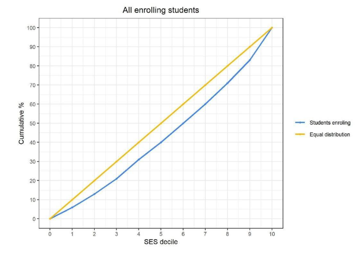
It shows that, amongst all individuals enrolled as full-time first-year students at one of these institutions in either December 2018 or December 2019, 6% were from the lowest SES decile, 13% were from the two lowest SES deciles combined – indicating that 7% were from the second lowest SES decile – and so on.
The fact that the blue line is underneath the yellow line throughout the distribution shows that students from lower SES backgrounds are under-represented amongst the population of students attending higher education compared to the overall population (and, correspondingly, students from higher SES backgrounds are over-represented). If instead the blue line were to sit above the yellow line throughout the distribution, this would indicate that students from lower SES backgrounds are over-represented amongst the population of HE students.
-
Identifying individuals who meet the entry requirements for each provider
Our approach to identifying the entry requirements for each provider is to infer them on the basis of the actual attainment levels of students attending the institution, rather than relying on advertised entry requirements. To identify both the entry requirements themselves and other individuals meeting the entry requirements for each provider, we first need to identify the attainment of each student in the base population.
3.1 Measuring attainment
3.1.1 A-level qualifications
As the vast majority of individuals who go straight to higher education after school/college have undertaken academic qualifications at Level 3, we focus on measures of Key Stage 5 attainment, which we take from the Key Stage 5 data tables in the NPD from the 2016-17 and 2017-18 academic years.
We began by observing attainment in GCE A level qualifications. The data table was filtered to include only these qualifications, and entries for A level qualifications in either General Studies or Critical Thinking were removed. We then counted the number of A level qualifications recorded for each unique PMR (i.e. student) within the dataset.
For students who had achieved more than three A levels, the three with the highest grades were retained in the dataset and the remaining A level qualifications were discarded. A total number of A level points was then calculated for each student in the dataset. Points for A level qualifications are allocated on the scale shown below in Table 6.
Table 6 – Points allocated to A level qualifications
| A level grade | Number of points allocated |
| A* | 60 |
| A | 50 |
| B | 40 |
| C | 30 |
| D | 20 |
| E | 10 |
3.1.2 BTEC qualifications
We then moved our focus to BTEC qualifications at Level 3. We filtered the original Key Stage 5 exam data table to include only those qualifications in the categories of BTEC Certificate Level 3, BTEC Diploma Level 3, BTEC National Diploma Level 3, BTEC National Extended Certificate Level 3, BTEC National Extended Diploma Level 3 and BTEC National Foundation Diploma Level 3. We then calculated a total points score in BTEC qualifications for all students who appeared in the dataset. This score was capped at a maximum value of 180, which is equivalent to achieving 3 A levels at grade A*. Table 7 below shows how points are allocated to BTEC qualifications.
Table 7 – Points allocated to BTEC qualifications
| BTEC qualification | Grade | Number of points allocated |
| BTEC Diploma Level 3 BTEC National Diploma Level 3 Band JBTEC National Extended Certificate Level 3 Band F BTEC National Extended Diploma Level 3 Band N |
Distinction* | 50 |
| Distinction | 35 | |
| Merit | 25 | |
| Pass | 15 | |
| BTEC Certificate Level 3 | Distinction* | 25 |
| Distinction | 17.5 | |
| Merit | 12.5 | |
| Pass | 7.5 | |
| BTEC National Foundation Diploma Level 3 Band H | Distinction* | 75 |
| Distinction | 52.5 | |
| Merit | 37.5 | |
| Pass | 22.5 |
BTEC qualifications can be awarded in a slightly different way to A level qualifications. For example, in a BTEC Diploma, it is common for a single qualification to be awarded with a string of different grades, such as DMM (or ‘Distinction, Merit, Merit’). In this case, the points score for this single qualification would be calculated as the sum of the number of points for each element of the overall result (i.e. 35 + 25 +25 = 85).
3.1.3 Other qualifications
GCE A level and Level 3 BTEC qualifications were used in this analysis as these are the most common qualifications used for entry to higher education. It is worth noting that some students may enter HE with other less common qualifications, such as the International Baccalaureate, Access to HE diplomas or Cambridge Technicals. Qualifications such as these were not captured in the analysis. As reported in the next section in Table 9, 11.2% of all enrolling students were observed to be neither enrolling with A level qualifications nor enrolling with Level 3 BTEC qualifications.
3.1.4 Matching Key Stage 5 attainment data into the population spine
Next, the A level and BTEC attainment data was matched into the original population spine (of those who took GCSE exams during 2015-16) using the PMR variable. For students who had achieved either 1 or 2 A level qualifications in combination with at least 1 BTEC qualification, we created a total points score measure by adding together totals of A level and BTEC points, capped at a maximum of 180 points.
Table 8 below shows the overall Key Stage 5 qualifications profile of all students within the overall population spine:
Table 8 – Composition of the population by qualification type
| Qualification type | Frequency (n) | Percentage (%) |
| A levels only | 206,160 | 35.0% |
| BTEC only | 85,128 | 14.5% |
| Combination of A levels and BTEC | 30,848 | 5.2% |
| Neither A levels nor BTEC | 266,164 | 45.2% |
| Total | 588,300 | 100.0% |
Table 9 also shows the Key Stage 5 qualifications profile of those students within the population who are observed enrolling at a HE provider:
Table 9 – Qualification type held among enrolling students
| Qualification type | Frequency (n, rounded) | Percentage (%) |
| A levels only | 136,335 | 68.3% |
| BTEC only | 25,470 | 12.8% |
| Combination of A levels and BTEC | 15,335 | 7.7% |
| Neither A levels nor BTEC | 22,380 | 11.2% |
| Total | 199,525 | 100.0% |
Individuals who take A Level and BTEC qualifications are slightly more socio-economically advantaged than the base population of all pupils. Figure 2 below shows the SES distribution of those taking Level 3 qualifications (defined here as taking either A level or Level 3 BTEC qualifications). On average, those who take Level 3 qualifications are slightly more socio-economically advantaged than those who do not take these qualifications.
Figure 2 – The socio-economic distribution of those with A-level and/or BTEC qualifications
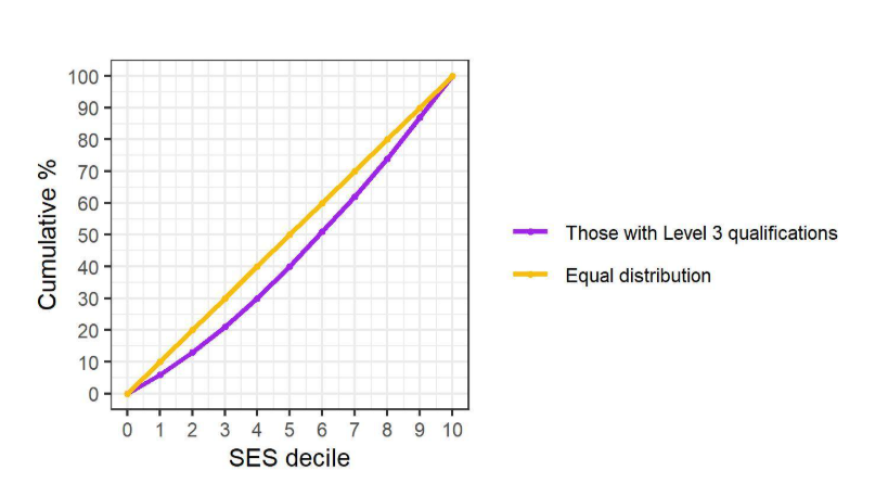
Table 10 – The socio-economic distribution of those with A-level and/or BTEC qualifications (figures used for Figure 2)
| SES decile | Frequency | Percentage (%) | Cumulative percentage (%) |
| 1 | 18,119 | 6 | 6 |
| 2 | 21,131 | 7 | 13 |
| 3 | 25,697 | 8 | 21 |
| 4 | 30,312 | 9 | 30 |
| 5 | 31,860 | 10 | 40 |
| 6 | 34,241 | 11 | 51 |
| 7 | 36,167 | 10 | 61 |
| 8 | 38,272 | 13 | 74 |
| 9 | 40,913 | 13 | 87 |
| 10 | 45,424 | 14 | 100 |
Prior research has also shown strong gradients in levels of attainment both between and within qualification types by socio-economic background, which are replicated in our population of interest. Figure 3 shows the SES distributions of those achieving at least grades AAA or equivalent at A level, those achieving at least grades BCC or equivalent at A level or BTEC and those achieving at least grades DDD or equivalent at A level or BTEC. Data tables relating to Figure 3 can be found at the end in the annex.
Figure 3 – The socio-economic distribution of those with different A-level and/or BTEC qualifications
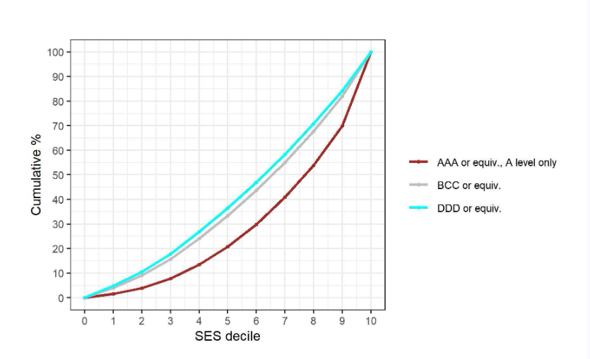
3.2 Identifying the entry requirements of different providers
3.2.1 Identifying the qualification entry profile of different providers
First, we sought to establish whether there were particular HE providers which only tended to admit students with A level qualifications and not BTEC qualifications. For such providers, we would not want to classify BTEC students with a high enough tariff score as ‘meeting an institution’s entry requirements’ if they were unlikely to be admitted.
For each HE provider, we identified the proportion of all enrolling students who had fewer than 3 A level qualifications and had also achieved BTEC qualifications. We consider such pupils to be “enrolling with BTEC qualifications”. Figure 4 below shows the distribution of HE providers by proportion of students enrolling with BTEC qualifications. The vertical line separates the providers where fewer than 5% of all enrolments are from students with BTEC qualifications, at which point there is a clear jump up. We found that for 12 HE providers, fewer than 5% of all enrolments were from students with at least one BTEC qualification.
These 12 institutions were Imperial College of Science, Technology and Medicine; London School of Economics and Political Science; The University of Cambridge; The University of Oxford; The University of Warwick; The University of Bristol; University College London; University of Durham; Newcastle University; University of Nottingham; The University of Exeter; The University of Southampton. For these institutions, we did not consider any students who had not achieved at least 3 A level qualifications to have ‘met the entry requirements’.
Figure 4 – Distribution of our 94 English HE providers by % of BTEC enrolments
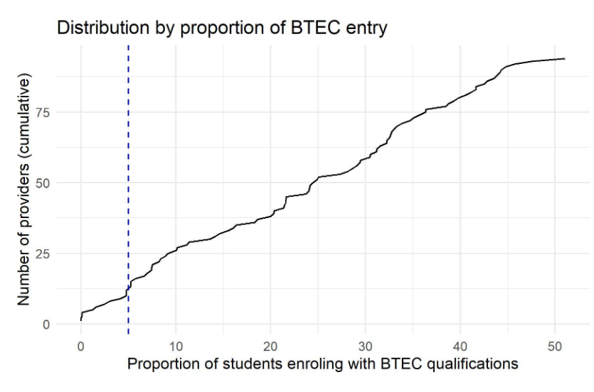
3.2.2 Allowing entry requirements to vary for different courses
There is higher demand for some subjects than others, meaning that there may be different entry requirements for different subjects, even within the same institution. For example, due to the limited number of places available, medicine often has higher entry requirements than other subjects. If we were just to look at the distribution of attainment of all students attending a particular provider in order to infer a single set of entry requirements for that institution, we might erroneously infer that entry requirements were lower for some courses than would actually be required, thus giving a misleading impression of the numbers and socio-economic status of students meeting an institution’s entry requirements. We therefore wanted to allow entry requirements to differ by course/subject.
During 2018/19, all HE courses were classified according to a system called “JACS3”. There are over 1,500 different course codes within the JACS3 categorisation, however these codes can be collapsed down into 19 broader subject groups – a categorisation referred to by HESA as “JACS A01”. Table 9 below shows the JACS A01 subject categorisation. As both JACS3 and JACS A01 variables were provided in the 2018/19 HESA dataset, we did not need to collapse course codes ourselves.
Table 9 – JACS A01 subject categorisation
| Code | Subject group |
| 1 | Medicine & dentistry |
| 2 | Subjects allied to medicine |
| 3 | Biological sciences |
| 4 | Veterinary science |
| 5 | Agriculture & related subjects |
| 6 | Physical sciences |
| 7 | Mathematical sciences |
| 8 | Computer science |
| 9 | Engineering & technology |
| A | Architecture, building & planning |
| B | Social studies |
| C | Law |
| D | Business & administrative studies |
| E | Mass communications & documentation |
| F | Languages |
| G | Historical & philosophical studies |
| H | Creative arts & design |
| I | Education |
| J | Combined |
There was a change in the way that university courses were classified by HESA between 2018/19 and 2019/20. In 2019/20, JACS3 was discontinued and replaced with a new categorisation called HECOS. For consistency, we therefore needed to map the HECOS categorisation to the JACS A01 categorisation shown in Table 9. To do so, we used mapping tables made available by HESA which were ingested (with permission) into the SRS. These tables enabled us to map HECOS codes to JACS3 codes (for the 2019/20 dataset) before these JACS3 codes were then collapsed down to the JASC A01 categorisation.
There is not a one-to-one correspondence between JACS3 and HECOS codes, though every HECOS code maps on to at least one JACS3 code. In cases where a HECOS code matched to more than one JACS3 code, we kept the match for the JACS3 code which appeared the most times (i.e. was allocated to the most students) in the 2018/19 HESA data.
3.2.3 Identifying entry requirements across courses within an institution
For each HE provider, we first identified all enrolling students. Students were then removed if no Key Stage 5 attainment data was available for them. For the 12 universities identified as not enrolling BTEC students, enrolling students were also removed if attainment data was not available for at least 3 A level subjects.
In each subject group at each institution, we then identified the students with the lowest 10% of Key Stage 5 attainment scores and these students were removed from the analysis. This was to prevent inference of minimum entry requirements on the basis of individuals who may have been admitted with contextual offers or may have had extenuating circumstances which meant they were accepted with lower grades than might have been typical.
After these removals, we established the minimum Key Stage 5 attainment score for each subject group. This was considered to be the entry requirement for that subject group at a particular HE provider. We undertook checks to see whether it mattered if we used a slightly different cut-off from which to infer minimum entry requirements, but this made relatively little difference overall. This is in line with Figure 3 above, showing that the socio-economic profile of students achieving BCC is very similar to that of students achieving DDD.
3.3 Identifying individuals who meet the entry requirements of different providers
In order to identify students in the base population who met the entry requirements for a given institution, we first needed to establish what proportion of all enrolling students at a particular provider were found in subject groups with different entry requirements. Subject groups were ranked from lowest to highest entry requirements and following this ranking, cumulative frequencies and percentages of students were established. It was then possible to observe, for a given Key Stage 5 attainment score, what proportion of enrolling students were studying on a course where entry with that level of attainment would be possible. These proportions were then used to assign qualification weightings to every member of the original population of prospective entrants. This method is best illustrated with an example. Table 11 shows some fictional data for an example university to illustrate the approach.
Table 11 – Example required grades weighting
| Subject group (JACS A01) | Entry requirement (Key Stage 5 points score) | Number of enrolling students | Cumulative frequency | Cumulative proportion |
| 9 | 120 | 98 | 98 | |
| F | 120 | 210 | 308 | |
| H | 120 | 98 | 406 | 0.2745 |
| 4 | 130 | 75 | 481 | |
| A | 130 | 112 | 593 | |
| E | 130 | 180 | 773 | 0.5227 |
| 2 | 140 | 60 | 833 | |
| 3 | 140 | 80 | 913 | 0.6173 |
| 5 | 150 | 24 | 937 | |
| B | 150 | 201 | 1138 | |
| D | 150 | 35 | 1173 | 0.7931 |
| 1 | 160 | 50 | 1223 | |
| 7 | 160 | 241 | 1464 | |
| C | 160 | 15 | 1479 | 1.0000 |
| I | NA | 0 | NA | NA |
| 6 | NA | 0 | NA | NA |
| 8 | NA | 0 | NA | NA |
| G | NA | 0 | NA | NA |
| Student Key Stage 5 attainment score | Qualification weighting |
| No Key Stage 5 attainment | 0 |
| Students without at least 3 A level qualifications (applies only to the providers in Error! Reference source not found.) | 0 |
| Less than 120 points | 0 |
| Less than 130 points, more than or equal to 120 points | 0.2745 |
| Less than 140 points, more than or equal to 130 points | 0.5227 |
| Less than 150 points, more than or equal to 140 points | 0.6173 |
| Less than 160 points, more than or equal to 150 points | 0.7931 |
| More than or equal to 160 points | 1 |
In this example, 27.45% of all enrolled students at the university are studying in a subject group where the entry requirement is 120 points. 52.27% of enrolled students are studying in a subject group where the entry requirement is 130 points or less, and so on. For this example university, any member of the original population of all prospective entrants with a Key Stage 5 points score which is less than 130 and also more than or equal to 120 would be assigned a qualification weighting of 0.2745. Any member of the population with a score which is less than 140 and also more than or equal to 130 would be assigned a weighting of 0.5227, and so on. Members of the population who would not be able to access any subject groups at the university, either because they have no Key Stage 5 attainment or the score they do have is less than 120, would be weighted 0. Members of the population who would be able to access every subject group at the university, because they have 160 or more attainment points, would be weighted 1. For each member of the base population, we therefore had a separate ‘qualification weighting’ for each provider.
For each provider we then produced a weighted frequency table, showing the weighted frequency of members of the population who met the entry requirements for that institution (as described above) and how they were distributed across the 10 SES deciles. These weighted frequencies were then use to calculate percentages, which in turn were used to calculate cumulative percentages. Frequencies have been rounded to the nearest 5 and percentages to the nearest integer. Table 12 below shows the results for an example provider:
Table 12 – Example ‘meeting the requirements’ results for an example provider
| SES decile | Frequency (unweighted) | Frequency (weighted) | From weighted frequencies | |
| Percentage (%) | Cumulative percentage (%) | |||
| 1 | 16,145 | 13,821 | 5 | 5 |
| 2 | 18,995 | 16,412 | 6 | 11 |
| 3 | 23,505 | 20,670 | 8 | 19 |
| 4 | 28,185 | 25,079 | 9 | 28 |
| 5 | 29,695 | 26,532 | 10 | 38 |
| 6 | 32,145 | 28,972 | 11 | 49 |
| 7 | 34,235 | 31,031 | 11 | 60 |
| 8 | 36,465 | 33,274 | 12 | 72 |
| 9 | 39,265 | 36,070 | 13 | 85 |
| 10 | 44,325 | 41,590 | 15 | 100 |
3.4 Incorporating location
Some higher education providers disproportionately recruit students from their local populations. For these providers, it might be easier for them to recruit a more socio-economically diverse student body if they are located close to large numbers of high attaining disadvantaged students. To understand to what extent this can help to explain the different socio-economic profiles of different providers, we wanted to reflect location in our analysis.
3.4.1 Establishing the location of HE providers
First, we needed to establish the geographical location of each HE provider. A data table of all HE institutions in England and their postcodes was created by accessing the Department for Education’s GIAS service and filtering all HE providers. This table was ingested into the SRS (with permission), and postcode data was matched into existing HE provider data using the UKPRN (UK Provider Reference Number) variable.
These postcodes were used to derive longitude and latitude coordinate locations for each institution. These coordinates were derived using the 2016 National Statistics Postcode Lookup data provided by the ONS in the SRS.
3.4.2 Establishing the location of pupils in the population
Next, the geographical location of each pupil in the population needed to be established. This was done on the basis of student postcodes from the Spring 2016 school census, when pupils were in Year 11.
As no individual location data is available within the NPD for independent school pupils, school postcode was used as a way of estimating the approximate location of these pupils. School-level postcode data was accessed using the Department for Education’s GIAS service before being ingested (with permission) into the SRS. A postcode was matched to each independent school student using the URN of the school they had attended during Year 11. In cases where postcode was missing in the NPD data for state school pupils (this was 2,746 pupils), school postcode was used if available (though it was only available in 314 cases). Only 2,650 pupils within the population had neither a home nor a school post code available, which is approximately 0.5% of all cases. 2,432 of these cases with missing postcodes were pupils in state schools, with 218 of the cases with missing postcodes relating to pupils in independent schools. This means that once location weighting is introduced into the analysis, the size of the base population reduces slightly from 588,300 to 585,650.
As with HE providers, the postcodes assigned to individuals were linked to latitude and longitude coordinate locations using the 2016 National Statistics Postcode Lookup data which is available within the SRS.
3.4.3 Incorporating location weighting
For each member of the base population (for whom we observed a postcode), we established the distance in kilometres between their estimated location at age 16 and the location of each HE provider. These distances were calculated by applying the Haversine function to the latitude and longitude coordinates for both student and provider location. To avoid very high weights, the minimum possible distance between a student and a given university was set at 1km. We then established a location weighting for a student in relation to a particular provider by taking the reciprocal of the distance in kilometres between their home at age 16 and the institution’s location.
For each student in the population, we now had two different weightings relating to each HE provider – a qualification weighting (described in Section 3.3) and a location weighting. When we wanted to take into account location in our analysis, we multiplied together their qualification weighting and location weighting to produce a combined qualification and location weighting. These combined weightings were then used to produce weighted frequency tables with percentages and cumulative percentages, in the same manner described above in Section 3.3. Table 13 below shows location weighting results for an example provider.
Table 13 – Example ‘meeting the requirements’ results for an example provider, with location weighting
| SES decile | Frequency (unweighted) | Frequency (weighted) | From weighted frequencies | |
| Percentage (%) | Cumulative percentage (%) | |||
| 1 | 16,125 | 176 | 5 | 5 |
| 2 | 18,975 | 213 | 7 | 12 |
| 3 | 23,480 | 263 | 8 | 20 |
| 4 | 28,140 | 316 | 10 | 30 |
| 5 | 29,650 | 314 | 10 | 40 |
| 6 | 32,115 | 367 | 11 | 51 |
| 7 | 34,220 | 357 | 11 | 62 |
| 8 | 36,460 | 383 | 12 | 74 |
| 9 | 39,250 | 408 | 12 | 86 |
| 10 | 44,030 | 476 | 15 | 100 |
3.5 Constructing the SES profile of those meeting the (location-weighted) entry requirements
As outlined above, our aim in identifying those meeting the (location weighted) entry requirements of different institutions was to understand to what extent these were driving different SES profiles of enrolling students.
To do so we can add to the graphs constructed in Section 2.3 an additional red line summarising the socio-economic profile of those students in the wider population who meet the provider’s entry requirements. As it is possible to construct this line in one of two ways, depending on whether or not location weighting is used, we constructed two graphs for each provider, one where location weighting is not used and one where it is used.
Continuing with the data from the example provider presented above, a red line can be constructed using the cumulative percentage column of Table 12 as the Y coordinates (with the SES decile column as X coordinates). This graph does not make use of location weighting, and is shown below in Figure 5.
Figure 5 – Graph for an example provider, without the use of location weighting
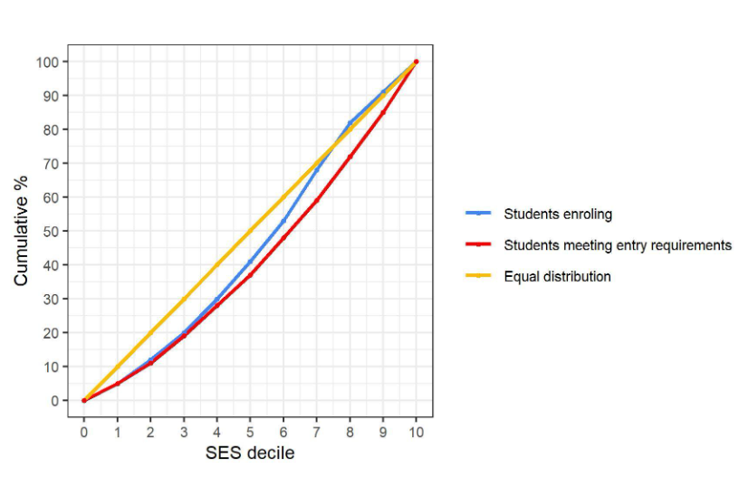
Alternatively, location weighting can be taken into consideration in constructing the red line, by using the cumulative percentage column in Table 13 as the Y coordinates. This is illustrated in Figure 6 below.
Figure 6 – Graph for example provider, with the use of location weighting
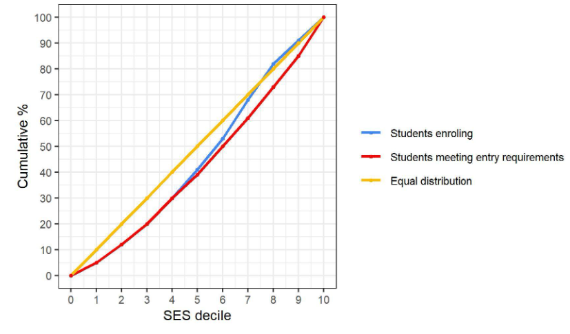
There is no change in the location of the yellow and blue lines across Figure 5 and Figure 6, only the red line is different, and in this case it does not make a significant difference. The main report outlines cases where the inclusion of location weighting makes more of a difference to the socio-economic profile of potential entrants.
Two different graphs were produced for each of the 94 different HE providers featured in the analysis.
-
Calculating ‘university benchmarks’ for HE access
Once graphs had been constructed, we then calculated the size of the area enclosed between different lines on the graph. This calculation was performed using integral calculus, within the RStudio statistical analysis software. Three different areas were calculated for each HE provider:
- The area between the yellow and blue lines was calculated by first establishing the area between the blue line and the X axis and then subtracting from this the area between the yellow line and the X axis. This calculation yielded a negative result for HE providers which recruited a disproportionately high number of students from more advantaged backgrounds. Conversely, the calculation yielded a positive result for HE providers that recruited a disproportionately high number of students from more disadvantaged backgrounds.
- The area between the blue and red lines (for graphs without the use of location weighting) was calculated by first establishing the area between the blue line and the X axis and then subtracting from this the area between the red line and the X axis. This calculation yielded a positive result when the enrolling population at a provider tended to be more disadvantaged, on average, than the group of students within the wider population who met the provider’s entry requirements. Conversely, the calculation yielded a negative result when the enrolling population at a provider tended to be more advantaged, on average, than the group of students within the wider population who met the provider’s entry requirements.
- The area between the blue and red lines (for graphs with the use of location weighting) was also calculated, in the same way described above.
The figures produced by this analysis should not be interpreted in a meaningful way, given that they were calculated by multiplying one dimension measured in SES decile by another dimension measured in cumulative percentage. Nonetheless, the sign (whether positive or negative) of the areas is informative. It could also be informative to compare the magnitude of a given area for one provider against the corresponding area for a different provider, or for providers to be ranked on the basis of these figures. Similarly, if this analysis were repeated in future, there would be the potential to compare the magnitude of areas, for any given HE provider, over time.
Table 14 below shows the sizes of the different areas for the HE providers featured in this analysis:
Table 14 – The sizes of areas enclosed between lines on the graphs, by individual HE provider
| HE provider | Area between yellow and blue line | Area between blue and red line (no location weighting) | Area between blue and red line (location weighting) |
| Anglia Ruskin University | 38 | 27 | -48 |
| Aston University | 184 | 99 | 83 |
| Bath Spa University | -35 | -2 | -126 |
| Birmingham City University | 152 | 71 | 66 |
| Bournemouth University | 0 | 14 | -91 |
| Brunel University London | 219 | 187 | 125 |
| Buckinghamshire New University | 64 | 81 | -19 |
| Canterbury Christ Church University | 108 | 117 | 25 |
| City St George’s, University of London | 210 | 109 | 111 |
| Coventry University | 154 | 141 | 65 |
| De Montfort University | 94 | 66 | 10 |
| Edge Hill University | 41 | 33 | -52 |
| Falmouth University | -42 | -47 | -133 |
| Goldsmiths College | 164 | 63 | 71 |
| Imperial College of Science, Technology and Medicine | 20 | -4 | -201 |
| Keele University | 38 | 32 | -52 |
| King’s College London | 34 | -37 | -78 |
| Kingston University | 155 | 154 | 72 |
| Leeds Arts University | -38 | -61 | -135 |
| Leeds Beckett University | 12 | -2 | -74 |
| Leeds Trinity University | 81 | 76 | -2 |
| Liverpool Hope University | 84 | 63 | -5 |
| Liverpool John Moores University | 44 | -1 | -47 |
| London School of Economics and Political Science | 43 | -17 | -155 |
| London South Bank University | 219 | 124 | 136 |
| Loughborough University | -45 | -33 | -157 |
| Middlesex University | 257 | 184 | 173 |
| Newcastle University | -53 | -24 | -214 |
| Norwich University of the Arts | 26 | 46 | -67 |
| Oxford Brookes University | -132 | -93 | -223 |
| Queen Mary University of London | 178 | 48 | 72 |
| Ravensbourne University London | 107 | -7 | 21 |
| Roehampton University | 210 | 175 | 126 |
| Royal Holloway and Bedford New College | 9 | 17 | -95 |
| Sheffield Hallam University | 29 | 14 | -59 |
| Solent University | 9 | 27 | -75 |
| St George’s, University of London | 81 | 38 | -22 |
| St Mary’s University, Twickenham | 79 | 69 | -7 |
| Staffordshire University | 102 | 99 | 18 |
| Teesside University | 120 | 84 | 32 |
| The Manchester Metropolitan University | 72 | 27 | -19 |
| The Nottingham Trent University | -7 | 2 | -98 |
| The University of Birmingham | -54 | -103 | -168 |
| The University of Bradford | 233 | 189 | 147 |
| The University of Brighton | 29 | 41 | -59 |
| The University of Bristol | -63 | 9 | -235 |
| The University of Cambridge | -51 | -11 | -247 |
| The University of Central Lancashire | 99 | 87 | 10 |
| The University of Chichester | -9 | 7 | -98 |
| The University of East Anglia | -15 | -11 | -116 |
| The University of East London | 253 | 141 | 170 |
| The University of Essex | 117 | 108 | 29 |
| The University of Exeter | -79 | -57 | -247 |
| The University of Greenwich | 211 | 110 | 125 |
| The University of Huddersfield | 149 | 119 | 60 |
| The University of Hull | 38 | 27 | -53 |
| The University of Kent | 77 | 84 | -21 |
| The University of Lancaster | -51 | -55 | -163 |
| The University of Leeds | -66 | -89 | -181 |
| The University of Leicester | 60 | 32 | -44 |
| The University of Lincoln | 5 | 3 | -86 |
| The University of Liverpool | -49 | -92 | -161 |
| The University of Northampton | 145 | 149 | 61 |
| The University of Oxford | -69 | -12 | -256 |
| The University of Reading | -43 | -4 | -141 |
| The University of Salford | 111 | 66 | 20 |
| The University of Sheffield | -40 | -38 | -157 |
| The University of Southampton | 1 | 27 | -171 |
| The University of Sunderland | 117 | 91 | 32 |
| The University of Surrey | 2 | 46 | -102 |
| The University of Sussex | -14 | 0 | -120 |
| The University of Warwick | 41 | 47 | -141 |
| The University of West London | 180 | 136 | 96 |
| The University of Westminster | 228 | 151 | 142 |
| The University of Winchester | -32 | 3 | -120 |
| The University of Wolverhampton | 198 | 153 | 115 |
| The University of York | -66 | -53 | -180 |
| University College London | 8 | -66 | -170 |
| University for the Creative Arts | 33 | 67 | -56 |
| University of Bedfordshire | 164 | 135 | 81 |
| University of Chester | 16 | 27 | -73 |
| University of Cumbria | 22 | 30 | -62 |
| University of Derby | 59 | 63 | -25 |
| University of Durham | -63 | -49 | -245 |
| University of Gloucestershire | -31 | 20 | -122 |
| University of Hertfordshire | 146 | 126 | 57 |
| University of Manchester | -18 | -58 | -130 |
| University of Northumbria at Newcastle | 8 | 15 | -83 |
| University of Nottingham | -18 | -14 | -186 |
| University of Plymouth | 0 | -1 | -89 |
| University of the Arts, London | 10 | -79 | -82 |
| University of the West of England, Bristol | -31 | -1 | -125 |
| University of Worcester | 23 | 45 | -66 |
| York St John University | 2 | 34 | -82 |
5. Limitations
While the methodology provides a robust framework for comparing university access, several factors must be considered when interpreting the results. These limitations arise from the nature of administrative data, the specific assumptions required for the modeling process, and the conceptual scope of the benchmarks.
5.1 Data limitations
NPD used in this study relies on proxies for SES as it does not contain direct administrative data regarding parental income or occupation.
- FSM eligibility only captures students who have officially registered for the programapplied for them. Consequently, students who meet the eligibility criteria but have not applied may be erroneously categorized categorised into higher SES deciles than is appropriate.
- IDACI serves as an area-based neighbourhood measure rather than a precise individual proxy. It is imperfect because high-income households can reside exist within deprived areas, and low-income households may live also be found in more affluent neighbourhoods.
- Students attending independent schools are automatically assigned to the most advantaged decile (Decile 10). This classification fails to account for students attending these institutions on bursaries or scholarships who may originate from low-income households.
The analysis of entry requirements is limited to A-levels and Level 3 BTECs, excluding other qualifications such as the International Baccalaureate, Cambridge Technicals, or Access to HE diplomas. As a result, approximately 11.2% of enrolling students with neither A-levels nor BTECs were excluded from the entry requirement portion of the analysis.
Geographical data is limited by the absence of individual home postcodes for independent school students within the NPD. To address this, the school postcode was utilised as a proxy estimate for student location.
In compliance with HESA reporting restrictions regarding low frequencies, 33 higher education providers were excluded from the analysis where observed frequencies were below 22.5 (these providers are listed in Table A1). These were primarily smaller or specialist institutions, and their removal represents 8.7% of total enrolments.
The age of the data reflects a pre-pandemic cohort who took GCSEs in 2015-16 and entered university in 2018/19 or 2019/20. It is important to note that trends in university access may have shifted following the Covid-19 pandemic.
5.2 Methodological limitations
Entry requirements were inferred based on the actual attainment of enrolling students rather than advertised grades, with the bottom 10% of achievers removed to account for contextual offers or other extenuating circumstances. This approach provides an estimation of the standard required rather than a definitive measure.
For 12 specific selective providers where BTEC enrolments were below 5%, students holding only BTEC qualifications were not considered to have met the entry requirements, regardless of the grades achieved.
Location weighting is based on the assumption that students are generally more inclined to attend universities closer to home. However, this weighting may be less relevant for national recruiters like the University of Oxford and the University of Cambridge, where students are oftenmay be willing to travel further for due to the institution’s prestige. Additionally, a minimum distance of 1km was arbitrarily set to address skewed weights resulting from the use of school postcodes for independent school students.
The distribution of students into equal SES deciles relies on the application of specific arbitrary cut-offs within the IDACI scores to ensure deciles remain of equal size.
5.3 Conceptual limitations
The scope of this analysis is focused exclusively on university access and enrolment. It does not assess subsequent student outcomes, such as continuation rates, degree classifications, or graduate earnings.
The benchmarks compare the profile of qualified individuals against those who enrol but do not account for application behaviour. Consequently, the analysis cannot definitively distinguish whether the under-representation of disadvantaged students at a university is due to a lack of applications (student preference) or specific institutional admissions practices.
Annex
List of data variables used
| Data table | Variable | Description |
| NPD – Key Stage 4 attainment data | KS4_PupilMatchingRefAnonymous | Used to link data with other tables |
| NPD – Key Stage 4 attainment data | KS4_FSM | Known to be eligible for free school meals during Year 11 |
| NPD – Key Stage 4 attainment data | KS4_FSM6 | Known to be eligible for free school meals at some point during the last 6 years |
| NPD – Key Stage 4 attainment data | KS4_NEW_TYPE | School type attended |
| NPD – Key Stage 4 attainment data | KS4_AGE_START | Age at the start of the school year |
| NPD – Key Stage 4 attainment data | KS4_IDACI | Income Deprivation Affecting Children Index (proportion) |
| NPD – Key Stage 4 attainment data | KS4_URN | Unique Reference Number of school attended |
| NPD – Spring census 2016 | PupilMatchingRefAnonymous_SPR16 | Used to link data with other tables |
| NPD – Spring census 2016 | IDACIScore_10_SPR16 | Income Deprivation Affecting Children Index (proportion) |
| NPD – Spring census 2016 | Postcode_SPR16 | Pupil postcode |
| HESA – 2018/19 | HE_PupilMatchingRefAnonymous | Used to link data with other tables |
| HESA – 2018/19 | HE_UKPRN | Provider reference number of the HE provider that the student is enrolled at |
| HESA – 2018/19 | HE_XPDEC01 | Indicates whether a student is a member of the December registration population |
| HESA – 2018/19 | HE_XFYEAR01 | Indicates whether a student is in their first year of study |
| HESA – 2018/19 | HE_XMODE01 | Indicates whether a student is full time or part time |
| HESA – 2018/19 | HE_XLEV501 | Indicates students’ level of study, e.g. undergraduate, postgraduate |
| HESA – 2018/19 | HE_XJACS01_1 | Course code presented using the “JACS3” classification |
| HESA – 2018/19 | HE_XJACSA01_1 | Subject family presented using the “JACS A01” classification |
| HESA – 2019/20 | HE_UKPRN | Provider reference number of the HE provider that the student is enrolled at |
| HESA – 2019/20 | HE_XPDEC01 | Indicates whether a student is a member of the December registration population |
| HESA – 2019/20 | HE_XFYEAR01 | Indicates whether a student is in their first year of study |
| HESA – 2019/20 | HE_XMODE01 | Indicates whether a student is full time or part time |
| HESA – 2019/20 | HE_XLEV501 | Indicates students’ level of study, e.g. undergraduate, postgraduate |
| HESA – 2019/20 | HE_XHECOS_1 | Course code presented using the “HECOS” classification |
| NPD – Key Stage 5 exam file 2017/18 | KS5_PupilMatchingRefAnonymous | Used to link data with other tables |
| NPD – Key Stage 5 exam file 2017/18 | KS5_SUBLEVNO | Qualification and assessment code |
| NPD – Key Stage 5 exam file 2017/18 | KS5_MAPPING | LEAP/LDCS subject mapping code – code that identifies the exam subject |
| NPD – Key Stage 5 exam file 2017/18 | KS5_POINTS_1618 | The number of points associated with the qualification achieved |
Table A1 – List of removed providers due to low frequencies
| UKPRN | Name of HE Provider | Total number of students (rounded to nearest 5) |
| 10000385 | The Arts University Bournemouth | 630 |
| 10008017 | Trinity Laban Conservatoire of Music and Dance | 190 |
| 10040812 | Harper Adams University | <22.5 |
| 10004048 | London Metropolitan University | 490 |
| 10007155 | The University of Portsmouth | 250 |
| 10007778 | Royal College of Music | 105 |
| 10003945 | The Liverpool Institute for Performing Arts | 185 |
| 10000712 | University College Birmingham | 175 |
| 10007760 | Birkbeck College | 210 |
| 10006841 | The University of Bolton | 555 |
| 10007780 | SOAS University of London | 325 |
| 10034449 | Leeds Conservatoire | 265 |
| 10037449 | University of St Mark and St John | 390 |
| 10001653 | Conservatoire for Dance and Drama | 100 |
| 10007811 | Bishop Grosseteste University | 340 |
| 10080811 | Hartpury University | 335 |
| 10000163 | Health Sciences University | 55 |
| 10007832 | Birmingham Newman University | 375 |
| 10005545 | Royal Agricultural University | 145 |
| 10007835 | Royal Academy of Music | 45 |
| 10007850 | The University of Bath | 725 |
| 10014001 | University of Suffolk | 495 |
| 10007657 | Writtle University College | 130 |
| 10007779 | The Royal Veterinary College | <22.5 |
| 10005127 | Arts University Plymouth | 230 |
| 10005523 | Rose Bruford College of Theatre and Performance | 95 |
| 10007816 | The Royal Central School of Speech and Drama | 90 |
| 10007825 | Guildhall School of Music and Drama | 105 |
| 10007787 | The University of Buckingham | 120 |
| 10007773 | The Open University | <22.5 |
| 10000936 | The University College of Osteopathy | 25 |
| 10007837 | Royal Northern College of Music | 105 |
| 10007761 | Courtauld Institute of Art | 45 |
Data tables used in Figure 3
Students with at least 3 Grade As at A level
| SES decile | Frequency | Percentage (%) | Cumulative percentage (%) |
| 1 | 556 | 2 | 2 |
| 2 | 775 | 2 | 4 |
| 3 | 1,327 | 4 | 8 |
| 4 | 1,968 | 6 | 14 |
| 5 | 2,447 | 7 | 21 |
| 6 | 3,114 | 9 | 30 |
| 7 | 3,796 | 11 | 41 |
| 8 | 4,409 | 13 | 54 |
| 9 | 5,484 | 16 | 70 |
| 10 | 10,288 | 30 | 100 |
Students with at least BCC or equivalent at A level or BTEC
| SES decile | Frequency | Percentage (%) | Cumulative percentage (%) |
| 1 | 6,951 | 4 | 4 |
| 2 | 8,462 | 5 | 9 |
| 3 | 11,320 | 7 | 16 |
| 4 | 14,277 | 8 | 24 |
| 5 | 15,617 | 9 | 33 |
| 6 | 17,594 | 10 | 44 |
| 7 | 19,422 | 11 | 55 |
| 8 | 21,334 | 13 | 68 |
| 9 | 24,086 | 14 | 82 |
| 10 | 30,658 | 18 | 100 |
Students with at least DDD or equivalent at A level or BTEC
| SES decile | Frequency | Percentage (%) | Cumulative percentage (%) |
| 1 | 12,160 | 5 | 5 |
| 2 | 14,614 | 6 | 10 |
| 3 | 18,738 | 7 | 18 |
| 4 | 23,115 | 9 | 27 |
| 5 | 24,557 | 10 | 36 |
| 6 | 26,957 | 11 | 47 |
| 7 | 29,211 | 11 | 58 |
| 8 | 31,654 | 12 | 71 |
| 9 | 34,408 | 13 | 84 |
| 10 | 40,394 | 16 | 100 |
Graphs which did not feature within the main report (non-location weighted)
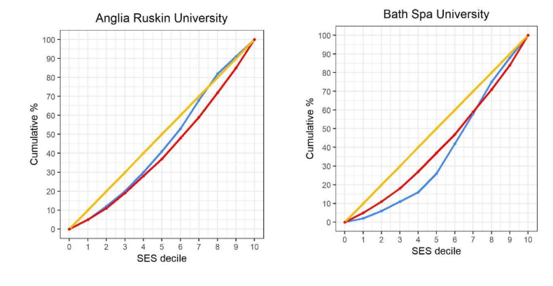
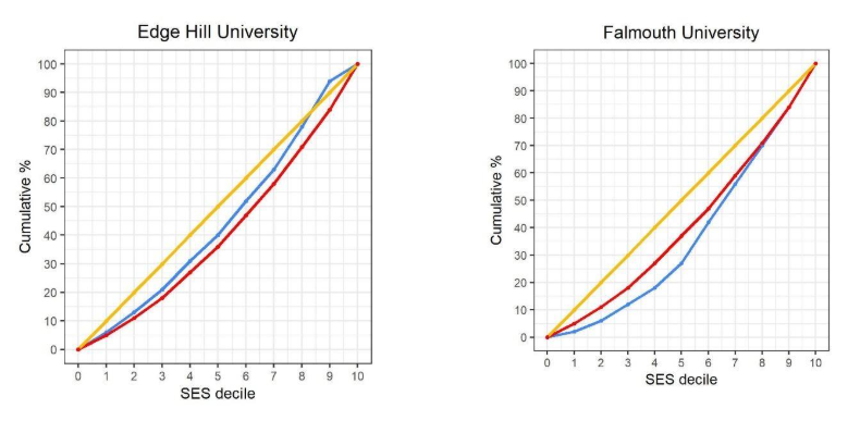
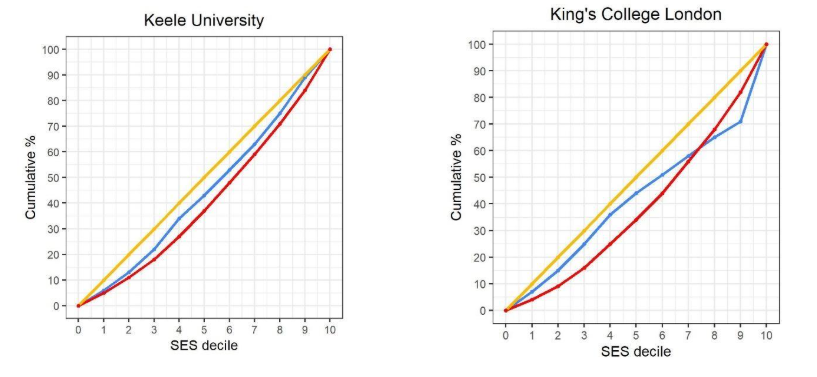
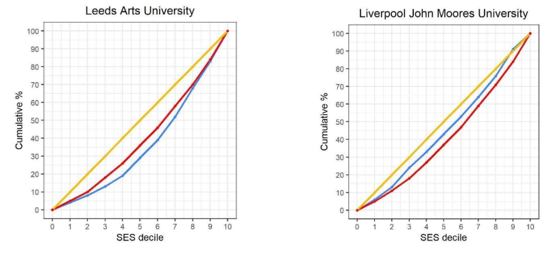
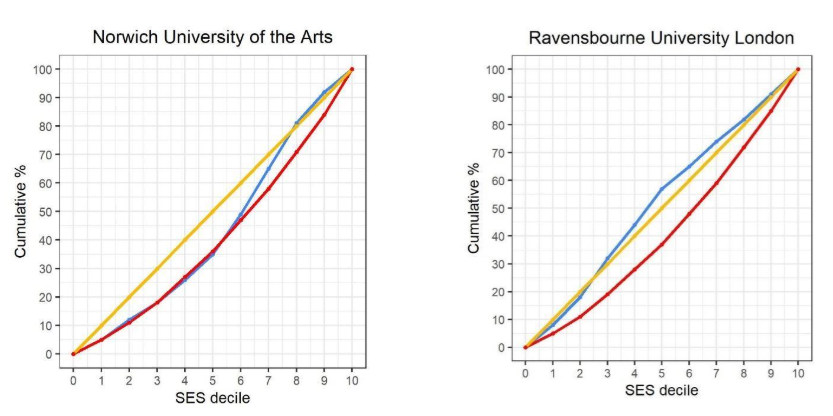
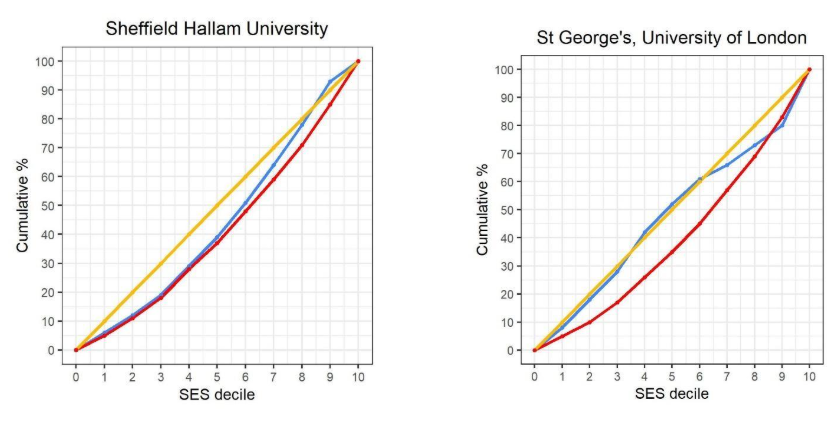
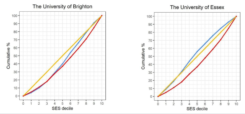
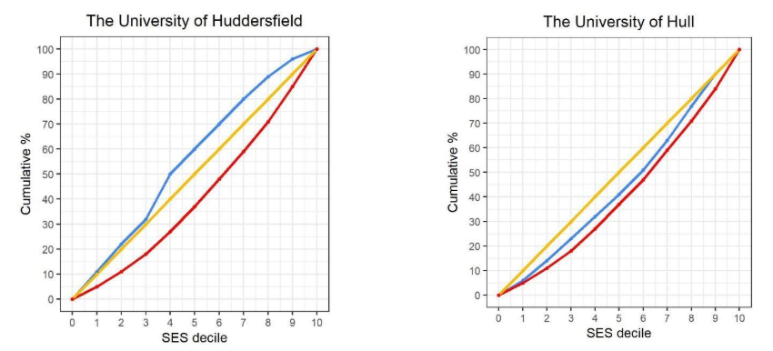
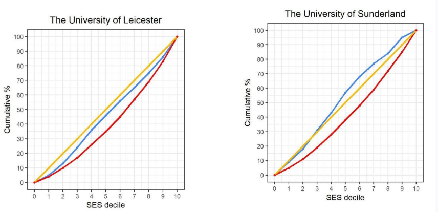
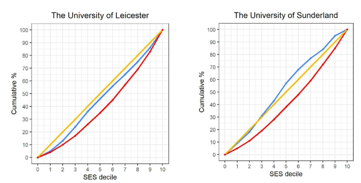
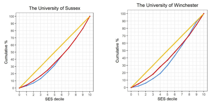
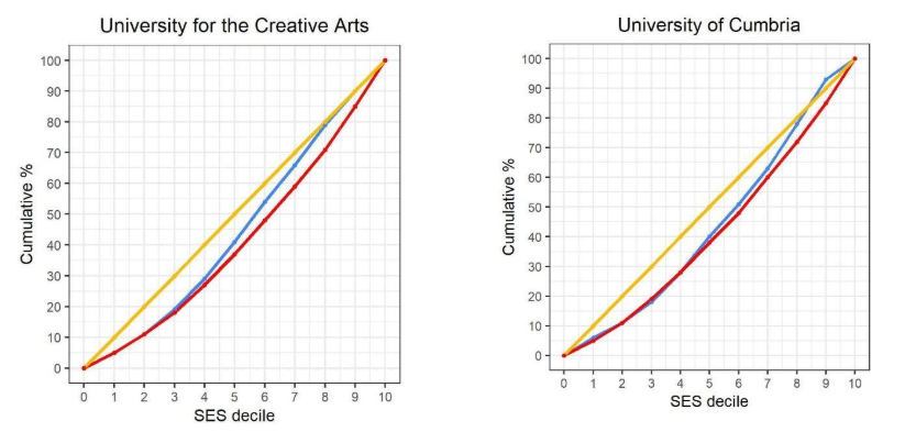
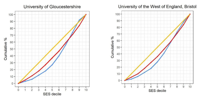
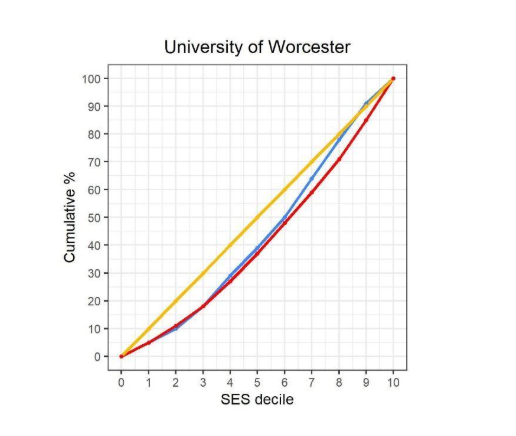
Disclaimer
This work was undertaken in the Office for National Statistics Secure Research Service using data from ONS and other owners and does not imply the endorsement of the ONS or other data owners.
Glossary
| Term | Definition |
| Access curve | A plotted line showing the cumulative percentage of enrolled first-year, full-time undergraduate students (on the y-axis) against their socio-economic background deciles (on the x-axis). By comparing this curve against a hypothetical baseline of equal distribution, the access curve reveals the extent of the gap in access to higher education by socio-economic background. |
| Entry requirements | Calculates entry standards based on the actual grades achieved by students who successfully enrolled rather than using the advertised grade requirements published on university websites. |
| Higher education provider/higher education institution | Used interchangeably to refer to providers in England registered with the Office for Students (OfS) in the approved categories and submit statutory data returns to the Higher Education Statistics Agency (HESA). This includes registered providers that do not hold the ‘university’ title. |
| High-tariff | Universities that are academically more selective and set higher than average entry requirements. |
| Location-adjusted | An analytical adjustment that refines a university’s expected student intake by taking into account where qualified prospective students actually live. |
| Low-tariff | Universities that are academically less selective and set lower than average entry requirements. |
| School attainment gap | The disparity in academic grades and qualifications achieved at school or college between young people from different socio-economic backgrounds. |
| Social mobility coefficient | A numerical benchmark that indicates how well a university is performing in recruiting socioeconomically disadvantaged students once school-level academic attainment is taken into account. |